Ways to Work it Wednesday: Layered Scallops
When I assigned the topic “Borders and Ribbons” for this Ways To Work It Wednesday post, I ended up with 3 layouts from the team with different variations on the same concept… and they’re all super neat! So instead of “borders and ribbons,” this blog post is all about different techniques for achieving a layered scallop look on your page!
Danica - On The Go & Going Slow
On The Go & Going Slow is such a happy kit. I created my scallops digitally (you can also use a template) and staggered them along the left hand side of my layout. I was going to have them cover the entire background later, but I really like that yellow gingham paper so I decided to only cover half of it. The rest of my layout was created using a template from Buzzbee Scraps called Page Starters 3.
Tip: You can easily align your scallops evenly down the page by selecting them all together and clicking “distribute vertically” in the top toolbar!
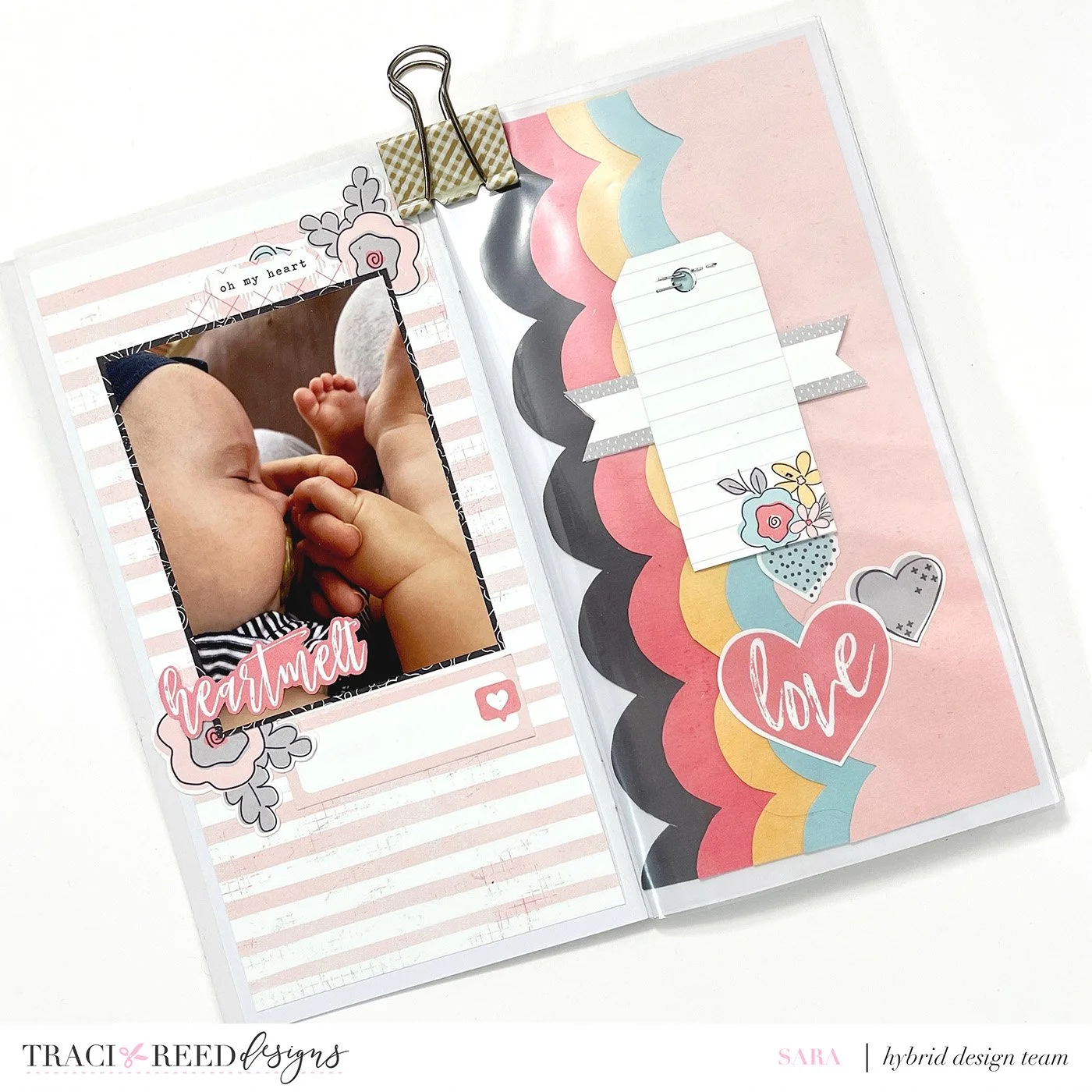
Sara - The Love List
Sara used a scallop template to hand cut her pretty borders for her TN spread. She used the solid patterns from The Love List collection for a striking scalloped page. Along with a peek a boo element for journaling,her spread is just as sweet as her photo.
Tip: Using solid colors (or tonal patterns) instead of multicolored papers can create a strong color blocked design with any border!
Stephanie - On The Go & Going Slow
In this beautiful printable collection called On The Go & Going Slow, there is this patterned paper with all the colors. I started to cut each color block with the intention to make little borders out of them. I pulled out my border punches, which has been a hot minute since I got crafty with those tools.
I liked the idea of putting the pattern back together with the new border edge. It gave this page a unique look and subtle background, making it my own. I adhered them onto another pattern paper to gain the TN size I lost cutting and adhering them back together.
I paired this page with some stamps and a TN signature pattern from this collection that I cut down to size and call this traveler's notebook layout complete. I can not express how refreshing it was to pull out those forgotten once loved tools and making my own border background.
Tip: Don’t be afraid to tuck bits in pieces in the new mini pockets you created, or use the new color blocked borders as places for stamps and journaling!


