Scraplift Saturday - Hybrid Team Member Kaye!
I hired Kaye to be on the team, because I love the way her gallery reflects her simple and clean photograph-based style. She always puts the emphasis right where it’s supposed to be and uses her product to emphasize the photos. The lifts in this post show a fantastic melding of that clean style with the other scrapper’s more embellishment-heavy styles and it’s so fun to see them come together and make magic!
Check out the team’s lifts of Kaye below!
Make sure you tag me on Instagram if you play along and use the hashtag #TRDScrapLiftSaturday!
Tai - Sunkissed
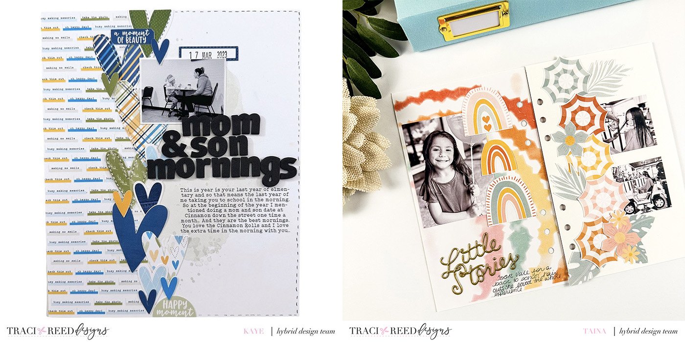
We are scrap lifting Kaye this week, and she has a wonderful feed full of inspiration. I was drawn to this layout with its row of heart embellishments down the middle. I always love a good cluster of one shape to create an impact on a layout. She used multi sized hearts, I decided to use this umbrella and floral die cuts from the Sun Kisses collection to re create the layout. I also decided to make my layout into a traveler’s notebook spread instead of a 12x12. It just brings the scale down to around an 8x8 which still keeps the layout the same. I also loved the use of a patterned paper on one side and the white space on the opposite. I did the same thing, with the tye dye papers from the same collection. It all worked out, I decided for variety in my photo sizes for my layout and switched them to black and white photos so they would not compete with the collection. I am documenting the story of taking Valentina for a back to school hair cut at the kiddo salon. She loved the experience and I loved taking her.
Tai scraplifted this layout of Vanessa’s using the Sunkissed collection! Kaye’s original layout uses the Wildflower collection!
Theresa - Renewal
Hi friends! I was so excited to have the chance to scraplift Kaye of create.with.kaye! Kaye’s fabulous use of these stars simply knocked my socks off and of course I had to scraplift this design for my own album! She created a half circle of stars from the Traci Reed Designs Renewal collection to go around her photo of her gorgeous son, stitching them in place and then adding a 3x4 pocket page to help tell more of her story. This collection is perfect for highlighting significant accomplishments, which for our River was getting their learner’s permit.
I decided to stay fairly true to the half circle star design she created, with the only change being that I hand drew the stitching instead of actually sewing. For the opposite page I’ve used a full 7x8.25” patterned paper but then kept the 2-3x4 design on top of that patterned paper. To accomplish that, I shrunk down one of the travelers notebook signatures and my photo so they would fit vertically on the page. The left a bit of room for just a few more embellishments! I also moved my numbers to this side, just to tie the signature and the patterned paper together.
I had so much fun scraplifting Kaye and I hope you will check out her incredible layouts for inspiration too!
Theresa scraplifted this layout of Kaye’s, both using the Renewal collection!
Ali - Weekender
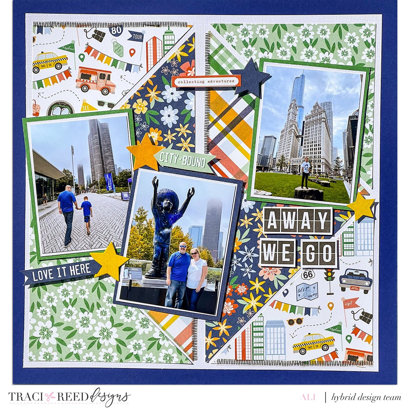
Hi everyone! It is Ali, @funadventureswithali sharing a scraplift of our design team member Kaye. I love the layout she created using sketch #37. I used the Weekender collection to create this layout of Aiden’s first trip to Chicago and love the bright colored papers. Thanks Kaye for the inspiration!
Ali scraplifted this layout of Kaye’s using the Weekender collection! Kaye’s layout uses the Tempest Collection!
Danica - Galentines
I lifted this layout from Kaye because I love traveler’s notebook style layouts but I scrap 12x12 digitally. I thought it would be fun to create a faux traveler’s notebook spread. For my layout I used Traci’s Galentines collection with the alpha from Aflutter. I recolored the alpha making it darker and duplicated the word GLAM down the right side of the layout. I had to add a tiny cluster to the left side of the page too. The layout came together quickly and I really like how the split background papers mimic a traveler’s notebook style.
Danica scraplifted this layout of Kaye’s using the Galentines collection! Kaye’s layout uses the Tempest Collection!
Evy - Weekender
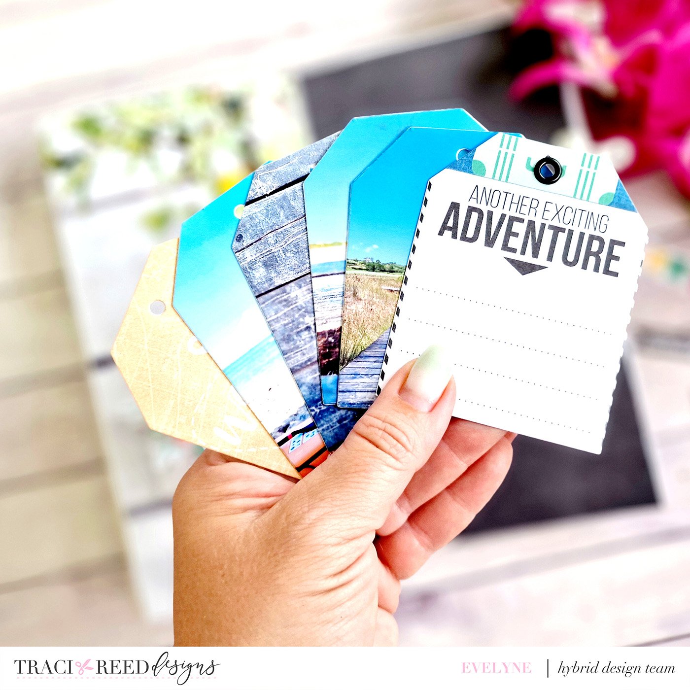
When I saw this project by Kaye, it seemed fabulous for those occasions where we have several photos but not enough to fill an album or we simply can't choose just one photo. However, I decided to adapt the project to my Travelers Notebook and to insert the pocket with the tags directly on a photograph (printed full page) which came out a little blurry but which I love! Inside the pocket I inserted other photos (cut with a tag punch) but also 2 cards, used as if they were the first and last page. I then added my caption and date right on the card. For the right page, simply the title of my project with some thickened diecuts, all from the Wanderlust collection.
Evy scraplifted this layout of Kaye’s, both using the Weekender collection!


