Scraplift Saturday - Boss Lady Traci!
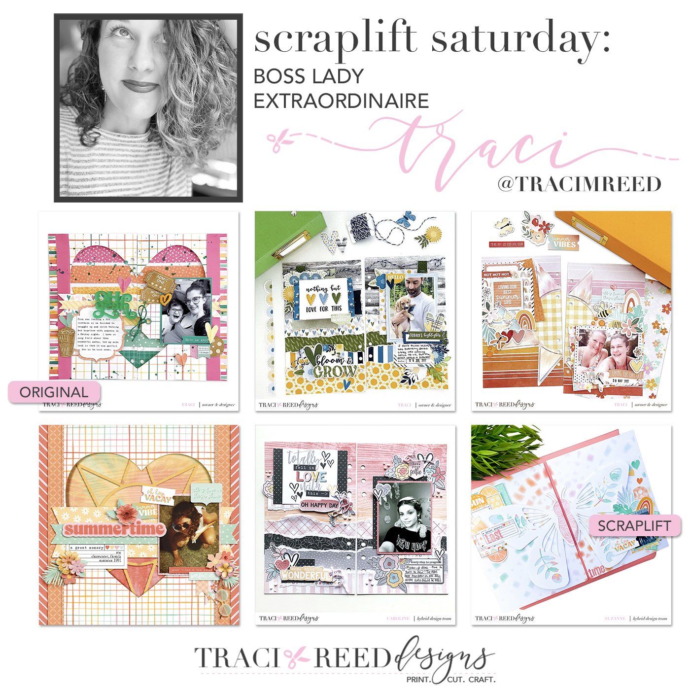
It’s my birthday and I’ll force the team to scraplift me if I want to! LOL! Seriously though, all of these lifts of my gallery are amazing and it’s such an honor for the girls to recreate my layouts!!
Caroline - The Love List
When I saw Traci post photos of this project recently I knew that I wanted to scraplift it. The layers of torn papers and interactive element really appealed to me and I couldn't wait to work with it.
I decided to work withThe Love List collection for my scraplift as I wanted to work with black and white photos to carry on the story of my daughter's Prom prep!
I knew I wanted to work with the gorgeous woodgrain from the collection as the main background piece for this and it was easy to pick other papers to layer up. The beauty of working with digital papers in a hybrid way is you can cut out any wasted paper and ink. Each of my pages here are 8.25" tall and 5" wide. I printed out strips of paper that were 10 inches wide and 2 inches tall for the layering at the bottom - rather than tearing from the full printed papers.
I followed Traci's design very closely in my placement of papers and focal elements but I switched things up where the interactive element was concerned. I really wanted to include two photos for this story but wanted to stay true to the original design and only show one on the spread. So I opted to move that flip up to the right hand page and include a photo under it - as well as additional journalling. A win-win solution!
I'm really happy with the way my scraplift turned out - easy when you are following the design of a page that you love!
Caroline scraplifted this layout of Traci’s using The Love List collection!
Danica - Sunkissed
It was so hard to pick a layout to lift from Traci. She has so many awesome layouts to choose from. Many of her layouts are two page travelers notebook style double page layouts, but that didn’t stop me from picking one to scrap as a 12x12 single page layout. I chose this particular layout from Traci because I loved the huge cut out heart she had in the background layer as well as the single photo option. I decided to use her newest collection Sunkissed for my page. I used the sun die cut she had included in the kit to decorate my cut out heart. I also sunglasses in the collection that match the ones I am wearing in my photo!
Danica scraplifted this layout of Traci’s using the Sunkissed collection!
Melinda - My Person
This one was a hard one to pick!!! BUT I love Traci's style (obviously!!) and after scrolling for a while I decided I would lift this page of hers for 2 main reasons. The first being that title - multi font, long title, I just ADORE this type of title so, so much. Second, the sentiment of the photos/journalling Traci chose. I've used the gorgeous My Person collection and paired it with 2 photo's of my boys and went with a very senitmental feel for my title. With multiple fonts, swoon!!
I've also stayed very close to Traci's orginal page with the 2 floral clusters on the corners of the photos. This was a super fun page to lift and I think one of my fave layouts this year!!
Stephanie scraplifted this layout of Traci’s using the My Person Collection!
Suzanne - Sunkissed
I loved this original post from traci! Shrubs always so brave with adding design paper as the base of her page! So I made this layout using the tie dye paper to start of the page. Then enlarged the butterfly cutfile and added design paper behind its wings.
Then I made 2 clusters on the side using the Sunkissed collection!
Stephanie scraplifted this layout of Traci’s using the Sunkissed collection!


