Pixels 2 Paper with Tai - Altering and Using Digital Embellishments for Paper
Hello my scrappy friends, my name is Tai (ty) and I am a new member to TR hybrid design team. I have been memory keeping for many many years and I hope you find inspiration with my projects featuring her digital products. I will be on the blog monthly sharing tips and tricks using her digital products in a physical way.
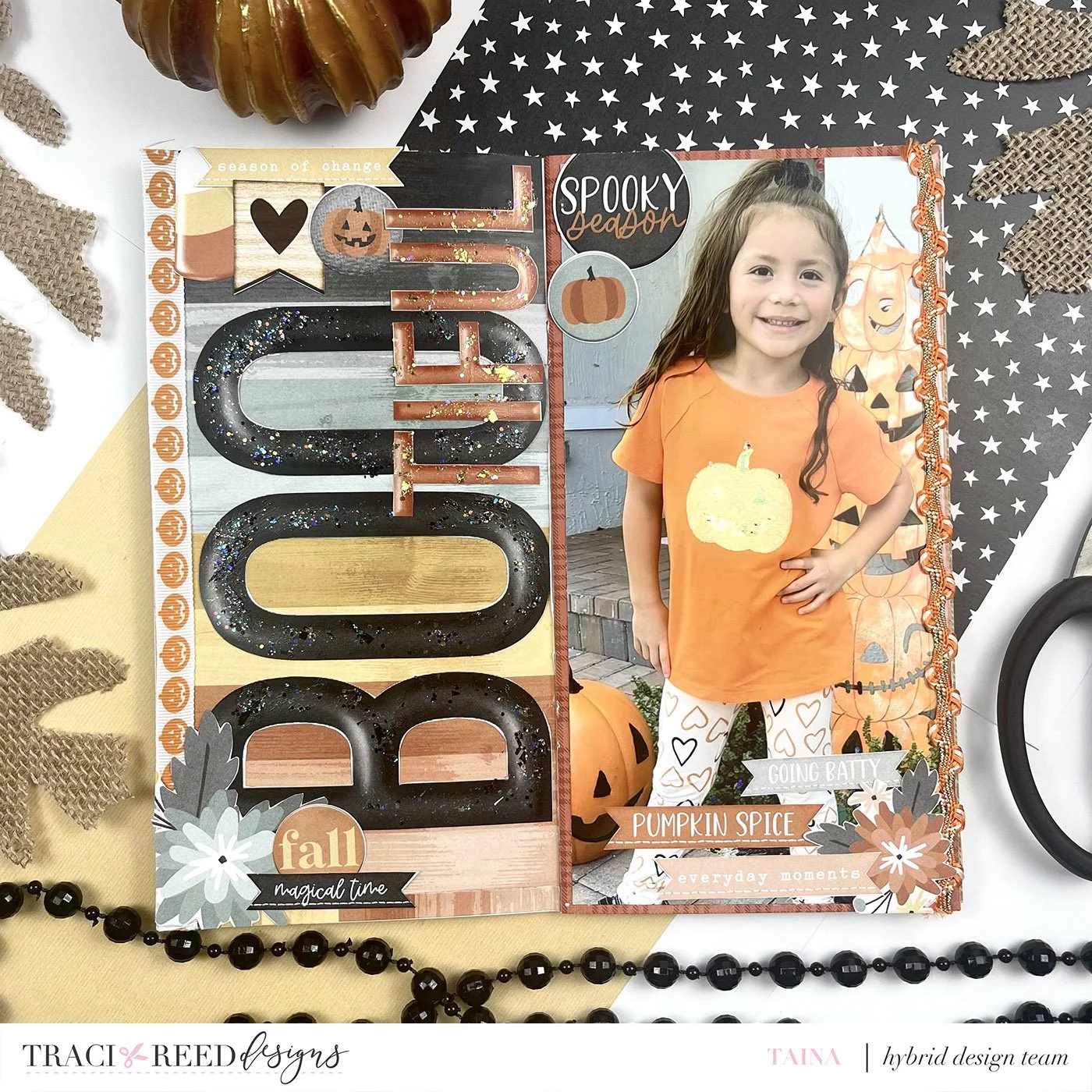
For my first project on the blog, I will be showing you how I pre planned my layout and adjusted the sizing of the ellies and alphas to create a unique traveler’s notebook layout. I am working with the Goldenrod Digital Kit.
In this collection you get a collection of different colored Alphas to use. I had a photo to use already in mind and wanted a cute title. BooTiful would work well for a halloween story. So, I took the letters in two different colors to create my title and enlarged it to fit the entire side of the TN insert. That instantly created a bold title. I used the second color for the second half of my title in order to create contrast. I decided to shrink down the second portion too, for even more contrast.
I scrolled through all the elements in the collection and selected a few circles and florals and added them to the page with altered sizes. Especially with the florals, I made one larger than the other and I thought I could make the embellishments clusters luscious.
I do not have a color printer at home, so I send these files to print at office depot. I then sent the 12x12 files and they just printed an 8x8 on a copy piece of paper. But these worked perfectly for a traveler’s notebook layout. My photo printing is also sent out to print at Walgreens or Amazon photo and I choose a full page photo for one of the sides of this layout.
Once I took the time to fussy cut all the pieces out, putting the layout together was rather simple and quick. Because of all that pre planning, it makes its process efficient. I had considered putting some foam underneath the letters to raise them up, but adding dimension into a TN is not a good idea in my opinion. But, I do like to add texture, so two different pieces of trim on both sides of the layout that were pumpkins and an orange rickrack.
My last final detail was adding black opal glitter onto of the black title and gold glitter paint on the orange letters. It adds the perfect amount of sparkle and shine to the layout. I love how this project came together. I hope this gives you ideas on preplanning a custom project with resizing elements from digital kits.
I hope you consider hopping over to my YT channel and enjoy my process video for this project.


