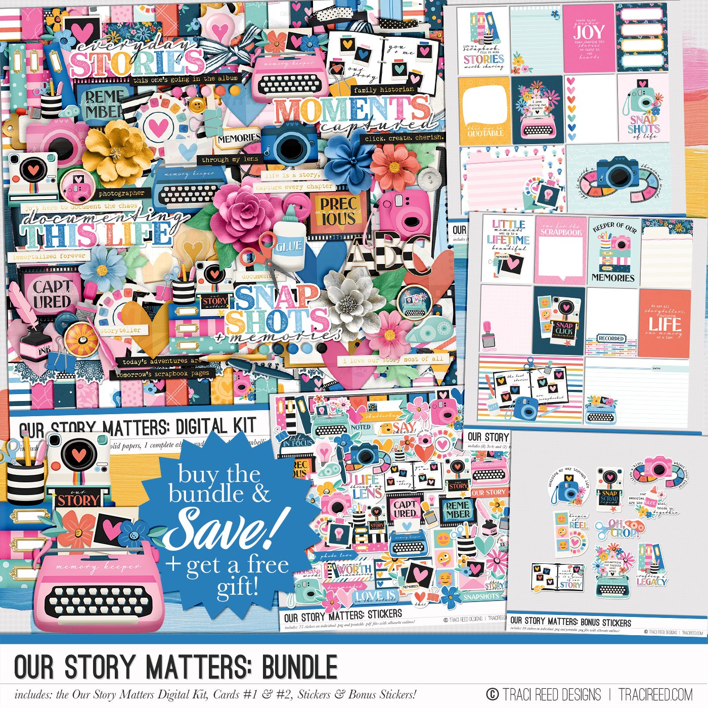
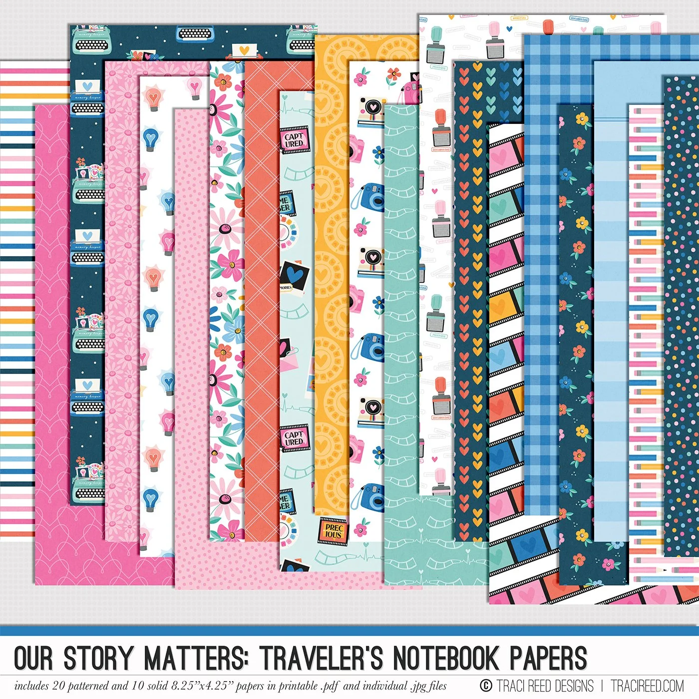
Design Principles: Repetition with Traci
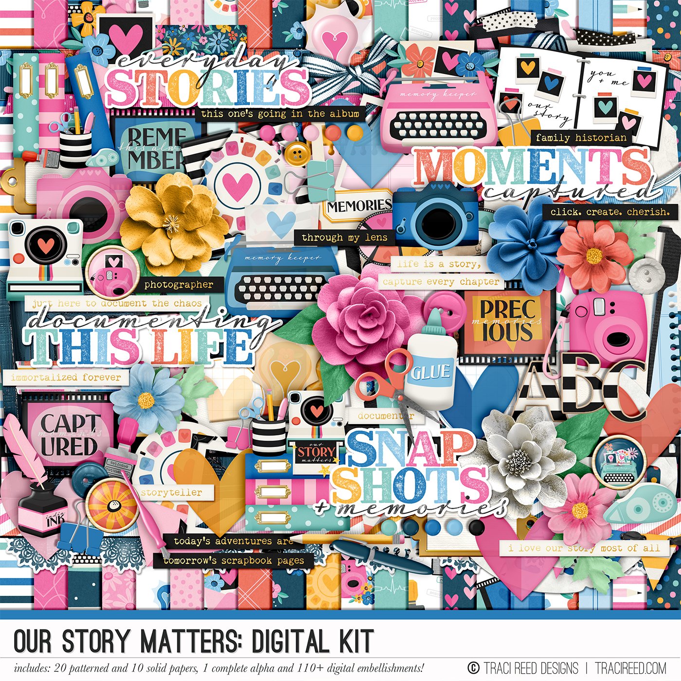
One of the easiest ways to create a balanced and visually appealing scrapbook page is by using repetition. Repetition is a design principle that helps bring unity to a layout by repeating elements like shapes, colors, or patterns. When done well, it makes everything feel connected and intentional. In this layout, made with the Our Story Matters collection and a digital template from Alchemy Wild Studio, you can see how repeating certain elements—like hearts, florals, and patterns—creates a strong, cohesive design. The consistent pink, blue, and yellow color palette also plays a big role in making everything work together.

Beyond just color and shape, repetition can be used to reinforce a theme. Here, circular frames are repeated to highlight different details of my office, tying them back to the main story. The striped patterns in the ribbon and titlework are another example of repeating design choices that connect different parts of the layout. Even the typewriter-style font in the word “OFFICE” helps tell the story, subtly nodding to the idea of documenting and creativity, which is what Our Story Matters is all about.

So how can you use repetition in your own layouts? Start by choosing a few elements to repeat—this could be a shape, a pattern, or even a specific embellishment. Try using those elements in different parts of your page to create a sense of flow. Repetition doesn’t mean everything has to match perfectly; it just means there’s a rhythm that keeps the eye moving smoothly across your layout. The next time you scrapbook, give this trick a try and see how it transforms your page into a beautifully cohesive design!