Digital-Style Layering for Paper Scrapbookers with Traci
As a scrapbooker who straddles both the physical and digital worlds, I’m well aware of the differences in style and technique between the two mediums. Paper scrapbookers are constantly fighting the war between over-stuffing their albums with too many layers and adding all. the. things. to their pages.
Digital scrapbookers have no such qualms because they can add anything they want to their pages without adding any extra bulk at all! This leads to a difference in style that can, at times, feel limiting as someone who does both!
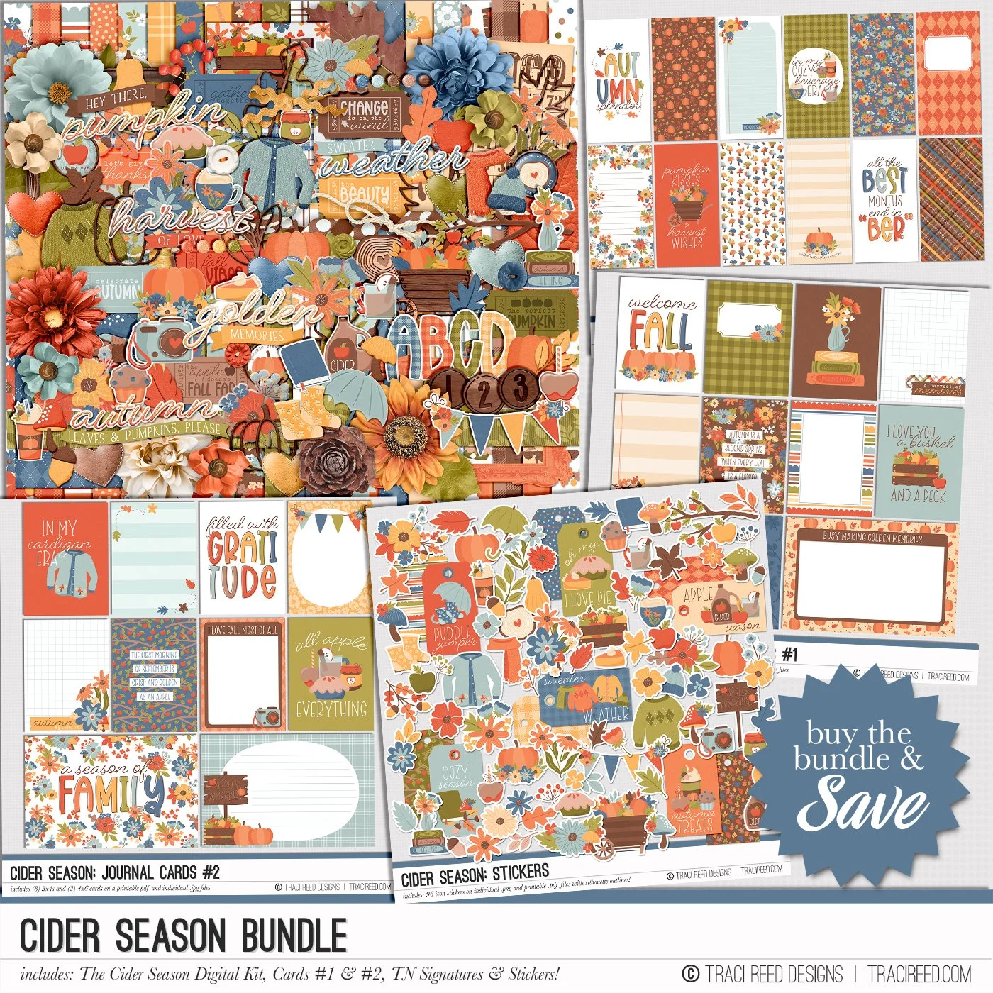
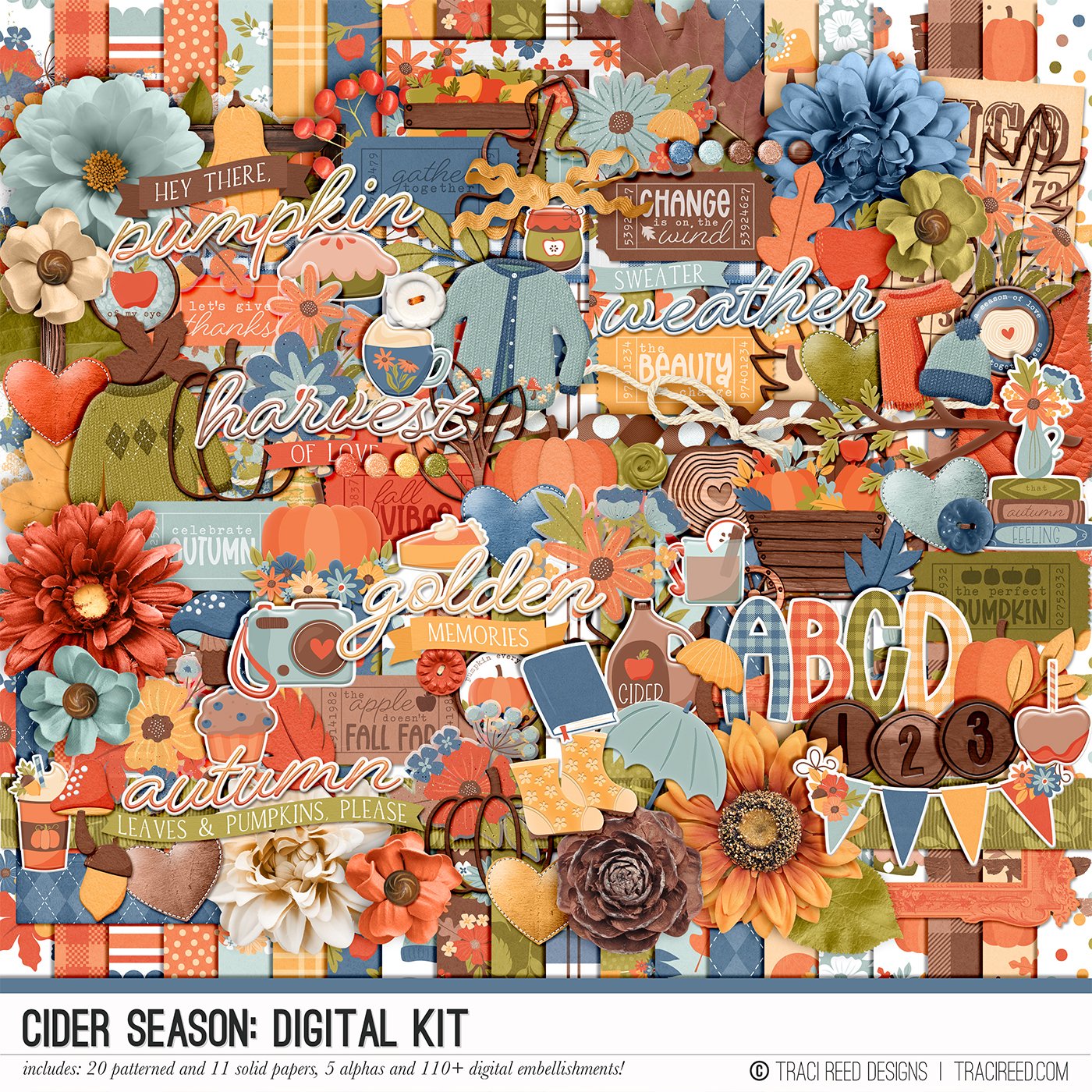
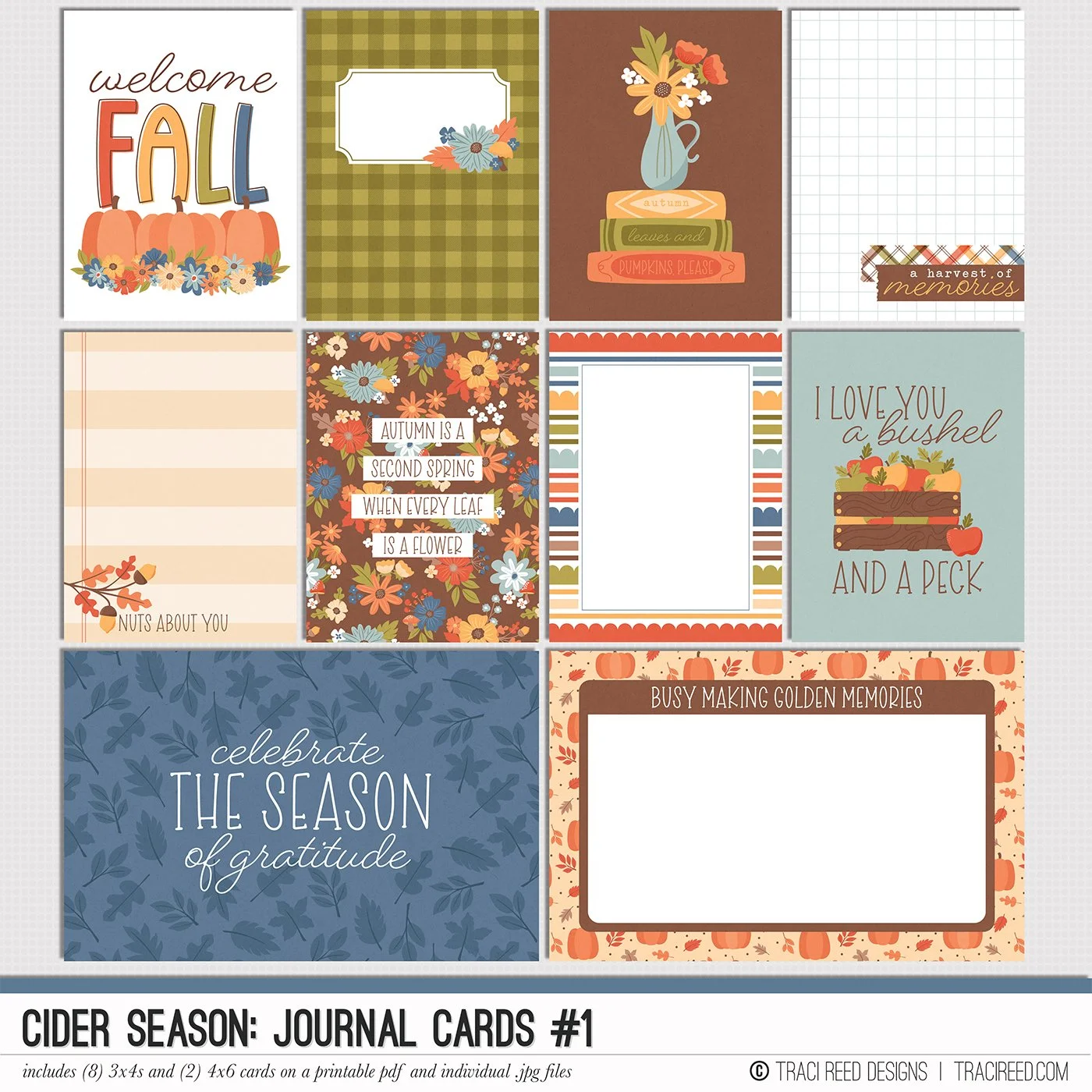
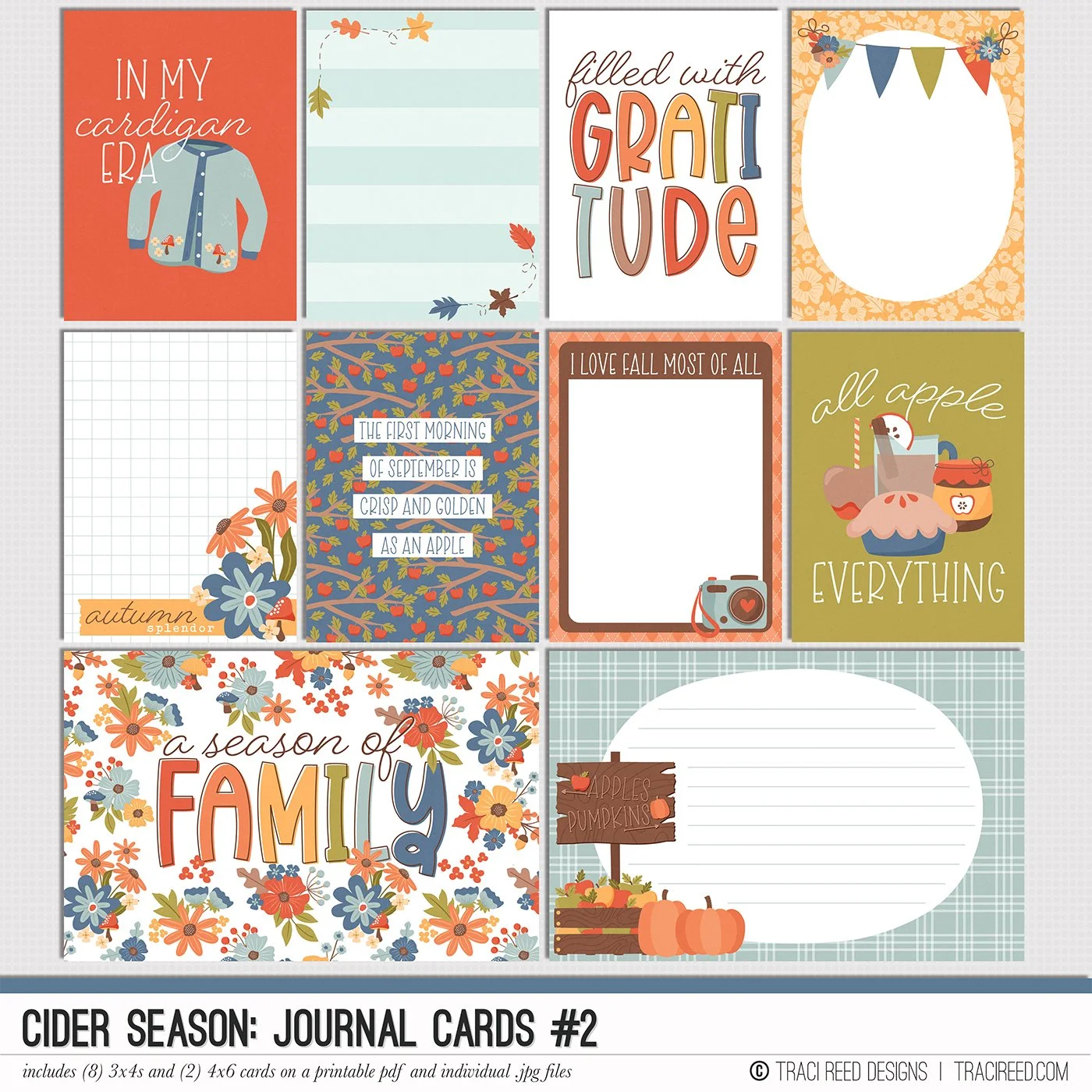
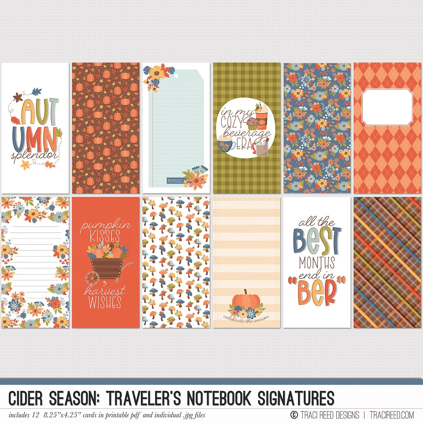
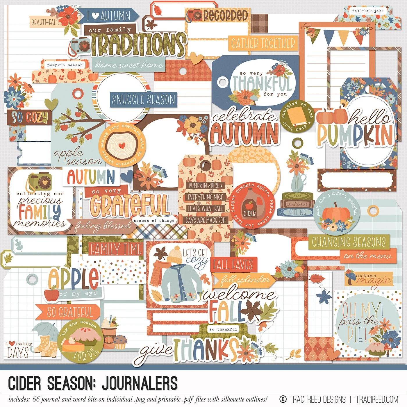
Today, I wanted to show you how I recreated that digital layered look on my paper page using the Cider Season collection and a template from Alchemy Wild Studio without adding too much bulk for my album!
The first thing I did to add depth to the page is my current go-to, double layering embellishments! You can see how the flowers and leaves float off the page. To do this, print two copies of each embellishment you want to double layer, then adhere them together in the center, leaving the edges unglued so that you can fold and roll the edges up for height.
The trick for adding a lot to your clusters is that not EVERYTHING has to have a lot of depth. I chose to double-layer my realistic flowers and the green leaves for that pop off the page, but then created the rest of the clusters with flat stickers. If I tried to make everything pop off the page, there would not only be not enough contrast between embellishment heights for the shadows, but it would add massive bulk to the page.
Lastly, I added realistic twine and buttons (a staple in digital scrapbooking!) to the page for texture and more realistic depth!


