Design Principles: Exploring Repetition with Leah
When creating a scrapbook page, there are a few design principles that play an important role in the overall design of a layout. Repetition is a tried-and-true technique that helps bring cohesiveness to a scrapbook page. It helps create a visually appealing and well-designed page. Repetition can be achieved in a number of ways including repetition of colors, shapes, words, elements, and photos. Today, I will show you some examples of how I applied this technique.
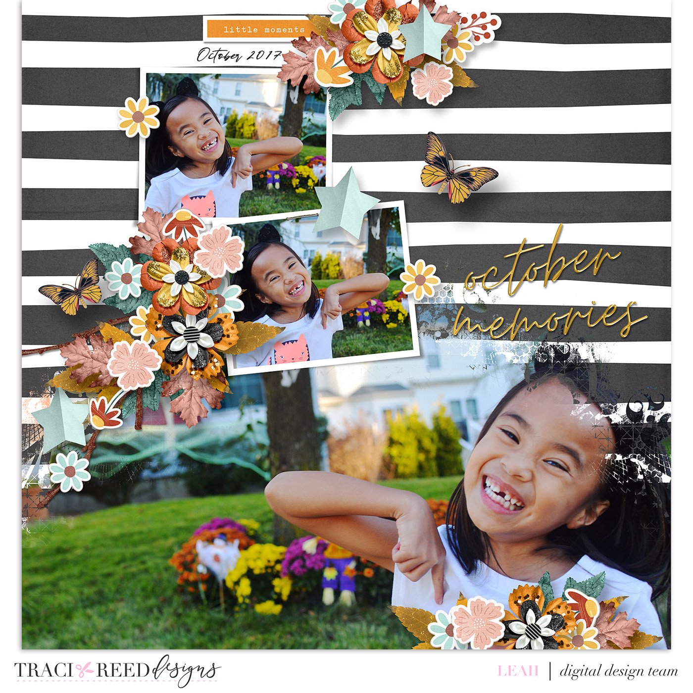
Repetition through photos
You can choose to use the exact photo multiple times, or you might also consider using the same photo in different sizes, with different effects, or in different colors. Another option is to display several photos that are quite similar without being totally identical. The choice is yours!
In my example below, I used the same photo multiple times but flipped the big photo to add interest.
Repetition through elements
It is easy to use the same or similar embellishments to decorate a page, whether they are flowers, hearts, butterflies, leaves, buttons, ribbons, etc. They help create a page that is eye-catching!
My layout used repeating flowers in various colors and shapes. Additionally, notice how I put 3 butterflies in green, yellow, and blue which kind of mimic the butterfly in the photo.
Repetition through shapes
I find repetition through shapes visually appealing. You can trim papers and/or photos in your desired shape. You can place text inside a shape or even add elements that repeat those shapes too.
Here I used repeating circles and semi-circles. Such a fun and creative way to design a page.
Whatever method you choose, repetition is a great way to add impact and visual appeal to your pages. I hope you will try this next time you create a layout.
TRD Products Used In This Post:


