Ways To Work It Wednesday - Word Bits
Hey Hey! It’s Ways to Work it Wednesday, the day we bring you an article on how to work normal things into your pages in different ways than you may have thought of!
Word bits are one of those things that are in every scrapbook collection. I like to include ones in my collections that aren’t always rectangles, but it seems like you just can’t get away from them! Today, Eve, Trish, and I are tackling how to add word strips to your layouts in less-obvious ways than the norm!
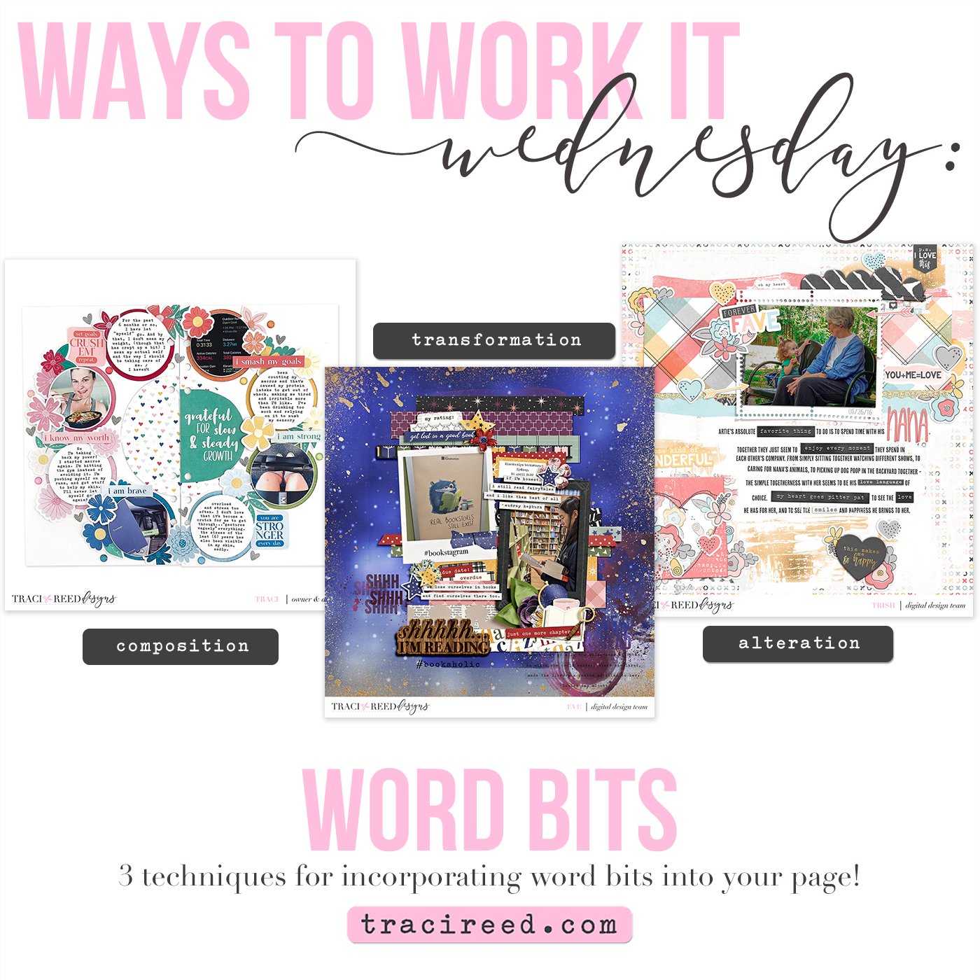
Eve - Ex Libris Galaxias
I love using word bits and I like to spread them around in my page. My journaling usually pretty short so these word strips help me to convey the story of my page. On this layout using Ex Libris Galaxias, I blended one of the word strips to the background papers and I chose one of the wooden word bit as my title.
Trish - The Love List
I love to use word bits and fun little word elements, but sometimes they don't exactly fit my needs. What I like to do is to tweak them just a bit so that they better fit the story of my page. A lot of times editing the wording with a simple removal of an s using the marquee tool is all I need to do. Sometimes I will use the lasso tool to cut part of the wording out to use or to remove, and sometimes I will cover a part of the word bit and add another word in to better fit my page.
The "forever fave" word bit on my page comes from The Love List collection but it originally said "current faves." I used the lasso tool to remove the "s" on faves, then I used it to select the gray around current, duplicate it, and then used the duplicated portion to cover the word "current," (making the label blank) and then added in the word "forever" instead. This way I changed what I thought was a super cute word bit that ALMOST worked - but not quite - into something that was perfect for my page.
Traci - Filled With Intention
On this page I created for Mix It Up Monday, I used the word bits in the Filled With Intention collection to break up roundness of the wreath I created and provide contrast to the circles in the free cut file. Because they’re rectangular, they provide a balance to the page and help anchor the composition.


