Ways To Work It Wednesday - Rework a Sketch!
Sketches are an amazing inspiration piece and jumping off point for any layout, but do you ever change them up? Chantal, Melinda, and Stephanie are showing you how they took 3 different sketches and changed them to suit their needs!
Chantal - School Daze
Sketches are a perfect starting point for a page. But you dont have to take it exactly how it is. It could be fun to change it up a bit. First I turned the sketch 90 degrees. Then I changed the squares into cirkels. And last I used a picture and quote card instead of a bigger picture. You see ... the changes give a totaly different vibe but you can still recognize the sketch.
Original Sketch
Melinda -My Story Matters
When Traci first shared this sketch I knew exactly what I could use it for but just didn't manage to "fit it in" at the time so when the "Change Up a Sketch" prompt popped up I was all over it!!
If you've been following me on socials for a while now you will know that just over 12 months ago I took the first step in creating a new smile for myself. I really wanted to document that first week after surgery having had 8 teeth removed and this sketch was just PERFECT!! As you can see I have started on Wednesday as that was the day I had surgery but other than that I have stuck very much to the sketch. I've used the "My Story Matters" collection and was so inspired after doing this double pager in my TN that I also created a couple of other inserts so stay tuned for those!
I loved that Traci included the cut file for the days of the week and I simply dropped the patterned cards into the boxes in Silhouette Studio, print and then cut. I have even included a flip up photo which sits outside of the page protector in the album for easy interaction.
I'm so thrilled to have started these series of pages and had so much fun creating a TN spread using a 12 x 12 sketch!!
Original Sketch
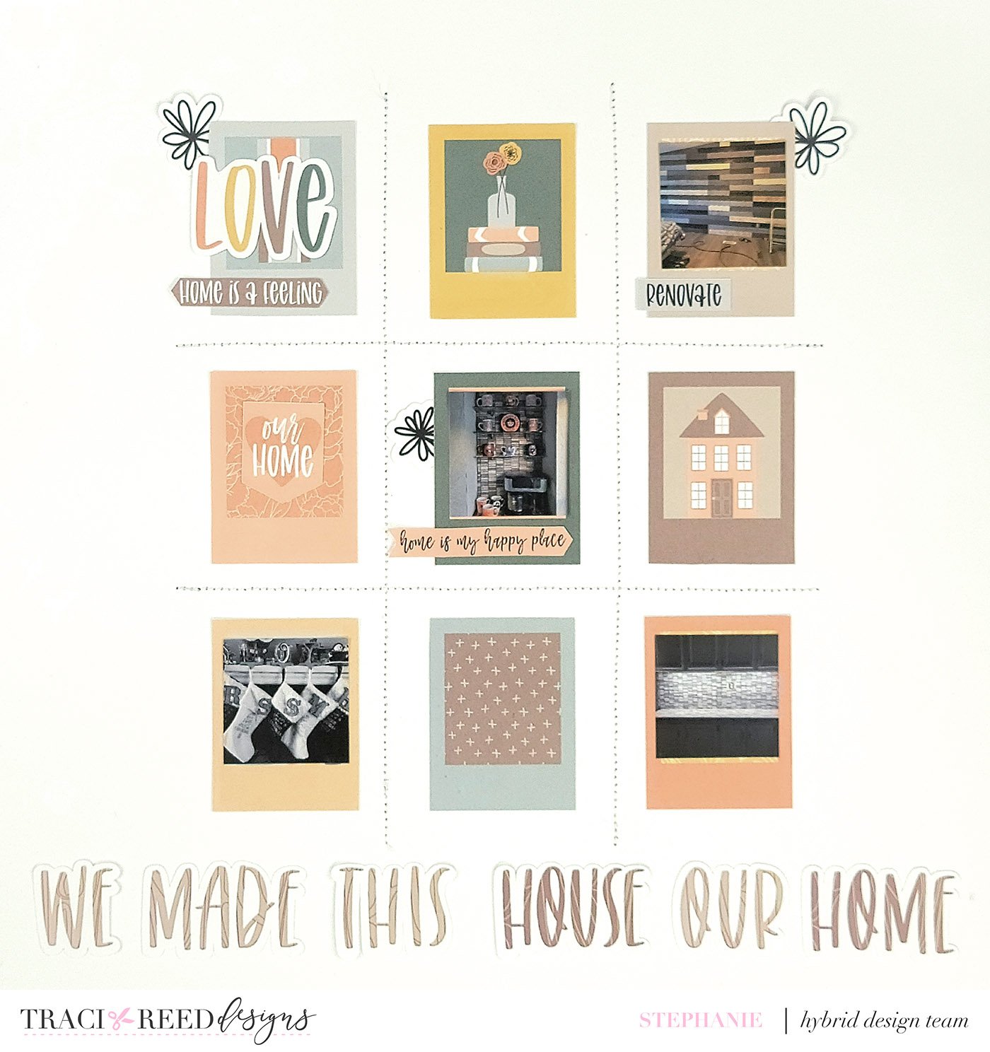
Stephanie - My Oasis
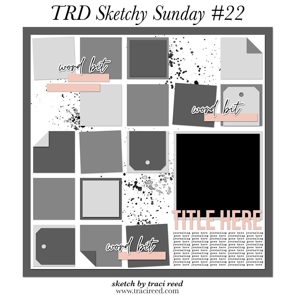
I really loved this grid sketch and wanted to create a layout with it. I also wanted to document the many little renovations we have been doing to our home. I decreased the amount of squares, and to make the grid apparent, I stitched a grid. I sized my photos to fit within some of the frames and added a few sentiments. To finish off this layout, I created a title using the digital alphas from the collection, which is called My Oasis.


