TRD Sketchy Sunday #54
Hey Hey Hey! We’re back with another fantastic sketch prompt for you today and the team is just FULL of inspiration! Check it out!
Click HERE to download a printable PDF file of the sketch!
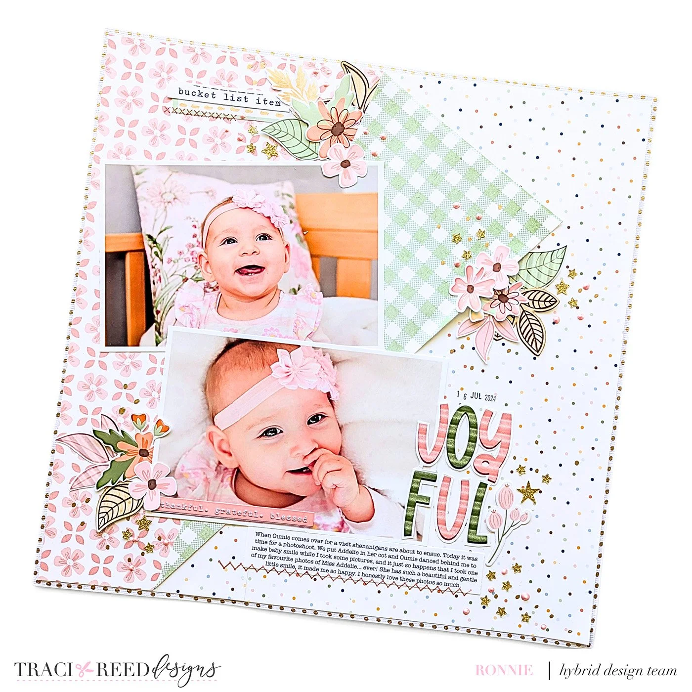
Ronelia - Equinox
Happy Sketchy Sunday 54! When choosing which of Traci’s amazing collections to use to tell my story I just couldn’t go past the beautiful muted pinks and greens of Equinox. I really liked the softness of this whole collection. It was a bonus that I had this fun sketch to use as well. I added lots of little sprinkly bits to the layout because that is my style at the moment, but other than that I stuck very closely to the sketch.
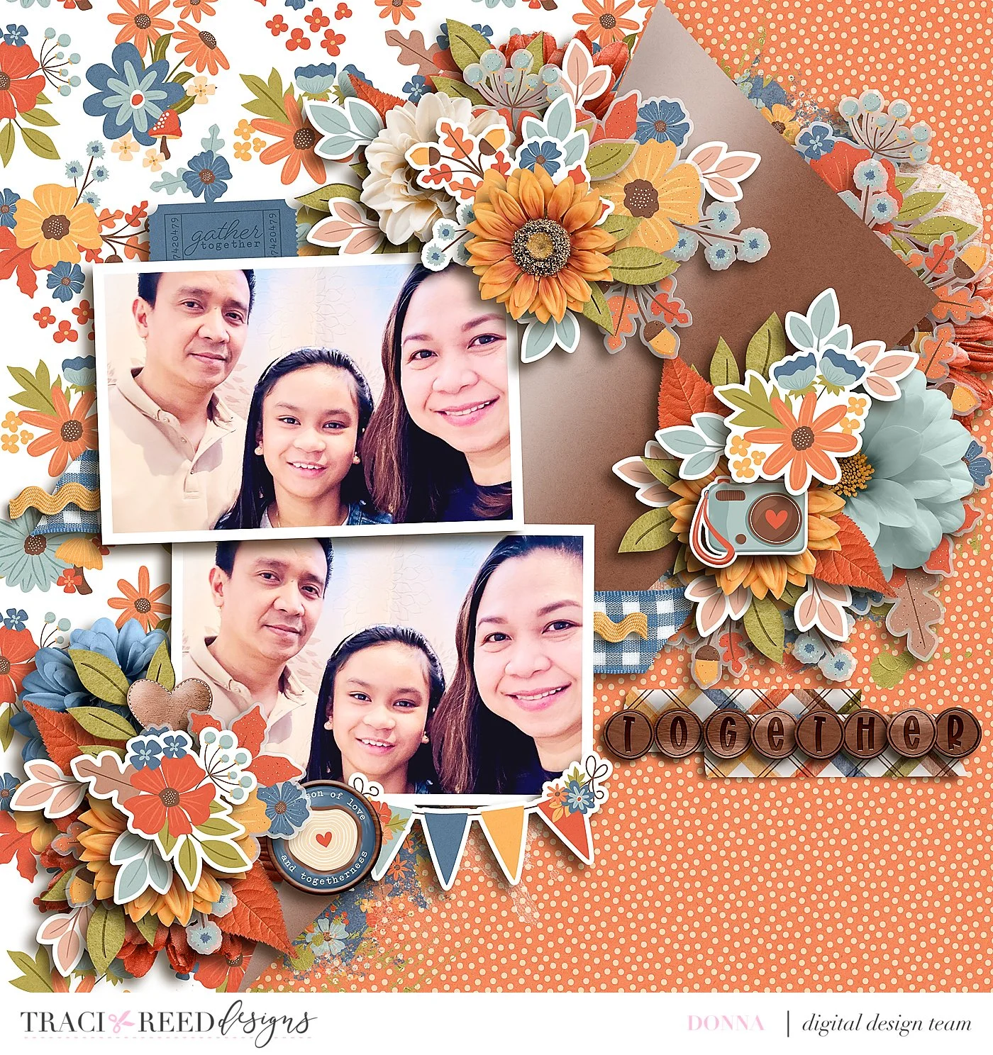
Donna - Cider Season
This layout looks complicated but it’s actually one of the fastest I have ever done. The sketch made it so easy for me. Once I decided on which papers to use, I just followed where to put all the elements/embellishments and then added even more for bulk.
Caroline - Cider Season
I originally intended to create at 12x12 size for this sketch, but when I saw the sketch I knew I wanted to challenge myself to create a Travellers Notebook spread since I am loving my notebook so much! It’s always super easy to switch sizes with Traci’s versatile sketches and I had fun rotating the photos too. I love the angular cut across the centre of the spread for a fun layered look, although I wanted to keep the bulk down so I didn’t do the fold (or even a faux fold!)
I worked with the current collection Cider Season for this one as it is just so beautiful that I can’t stop creating with it!!!
Theresa - Bountiful
This Sketch is perfect for two-photo layouts, which happen to be one of the most common types of layouts I do for our childrens’ album! I combined this sketch with the lovely Bountiful collection from Traci Reed for a fall themed layout at the pumpkin patch. I loved using this sketch for one main photo and one secondary photo, the secondary one shows all four of the kids together while the main photo is of our main character here - Asher. One way I altered the sketch was with the title; I brought it down a bit lower and then extended the word “Pumpkin” to the bottom so the word would fit. Another change I made was by adding a piece of a journal card, the grid, beneath the journaling so the words would be a little easier to read against the busy patterned paper I chose. Overall such a usable sketch and I am so happy with how my layout turned out!


