Silhouette Tutorial: Create A Pie Chart Photo Collage with Becky!
I don’t know about you but I enjoy creating a year in review layout and this year I decided to do it using a template I created in Silhouette Studio as I don’t have PSE. To start I found a pie chart as a free download on the web and imported the jpeg into Studio and sized it up to about 11x11 inches. I then went to the trace panel, traced it
Once I’d traced it I lifted away the area I didn’t need which left me with a piechart outline. I created a circle to put in the middle of the chart and duplicated this twice and put two of them to one side (I’ll need these later!).
I selected the pie chart and the circle and went to the modify panel and clicked on subtract and this left me with piechart segments without a middle, but it had an outer circle.
I selected the shape and clicked on release compound path and removed the outer circle. I then grabbed one of the circles I had put to the side, and placed it back in the centre of the shape, selected the whole shape and filled it with red (any colour will do).
The remaining circle (which I had coloured blue) was moved into the middle of the shape, I selected both shapes, clicked on subtract in the modify panel and this left me with empty, but red, segments to insert my photos.
I imported a photo which came in huge, so I sized it down to about 3”x4” and then moved it to the segment I wanted it to go into. At this point I took the colour out of each of the segments so that I could see the photo behind it. I moved the photo and sized it until the area I wanted to show was within the segment then selected the segment and the photo and clicked on crop in the modify panel. I repeated for each segment.
It was then just a case of adding the registration marks, printing it and then cutting it out on my Silhouette. If you haven’t got a wide format printer you could move each segment to fit as many as possible onto A4/letter just to print out the segments and use the template as a cutfile to cut out and then place onto your patterned paper to place your photos.
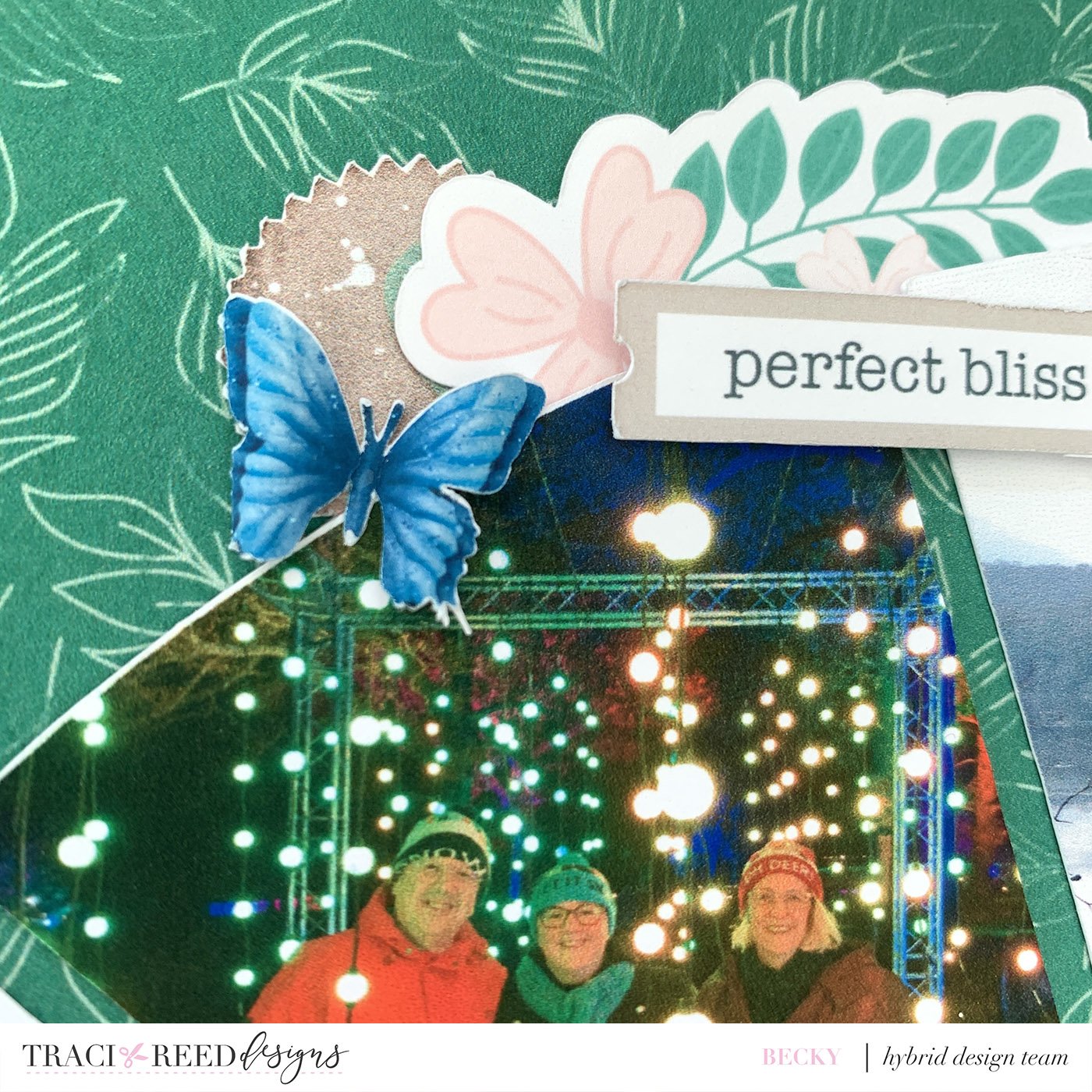
Once I had my photos cut out I grabbed the Felicity collection and the green leaf paper as my background. I stuck the photos down then created five spots of embellishments. I used mostly blue, pink and kraft colour embellishments as they complemented my photos and the green background paper best and didn’t compete with the many coloured photos!
A few Nuvo Drops for butterfly trails finished this layout off nicely!
I just love how this layout looks and I’m thinking I may put it in a frame and display it!
I have done a quick YouTube video showing how I created the template so please do have a look if you would like to see the instructions ‘in action’. Just a note that there may be an easier way to do this, I am not an expert in using Silhouette but this worked for me!


