Mix It Up Monday: My Oasis + #Indoorsy
Hello and welcome to the fifth edition of our fun series: Mix It Up Monday! When I told the team that I would be pairing the brand new My Oasis collection with the #Indoorsy collection for Mix It Up Monday, there was....hesitation, despite these two collections having similar themes! I think it’s because the colors, at first glance, don’t mesh quite as well as some of our other Mix It Up Monday choices, but part of the fun is working outside the box.
In the end, I think I won them over 😉
Check out the examples below to see how well these two collections go together with tips on combining them!
Melinda
Somehow I'd totally missed the #Indoorsy collection but boy am I glad I jumped on to today's Mix It Up Monday post cause it's simply gorgeous!!
I've started with one of the 12x12 digital papers from the My Oasis collection in Photoshop and then opened a bunch of the digital mixed media embellishments from the #Indoorsy collection to create my background.
You can see all of the layers in my process video but I have layered them all up to create my background which I then printed on textured white cardstock. I've flipped, rotated, re-sized and copied the different elements and just LOVE the background I created!!
With most of the designing work already done in PSE it was pretty easy to add the photo, title and a few extra bits & pieces! If you didn't know that I had created this page using 2 collections you certainly would never know! Oh, the only thing that I felt wasn't a "perfect" match was the red in the elements from the #Indoorsy collection which I made work by adding it diagonally to my background and also stamping with Fired Brick Distess Oxide to bring to the forefront of my layout too!!
Process Video
Caroline
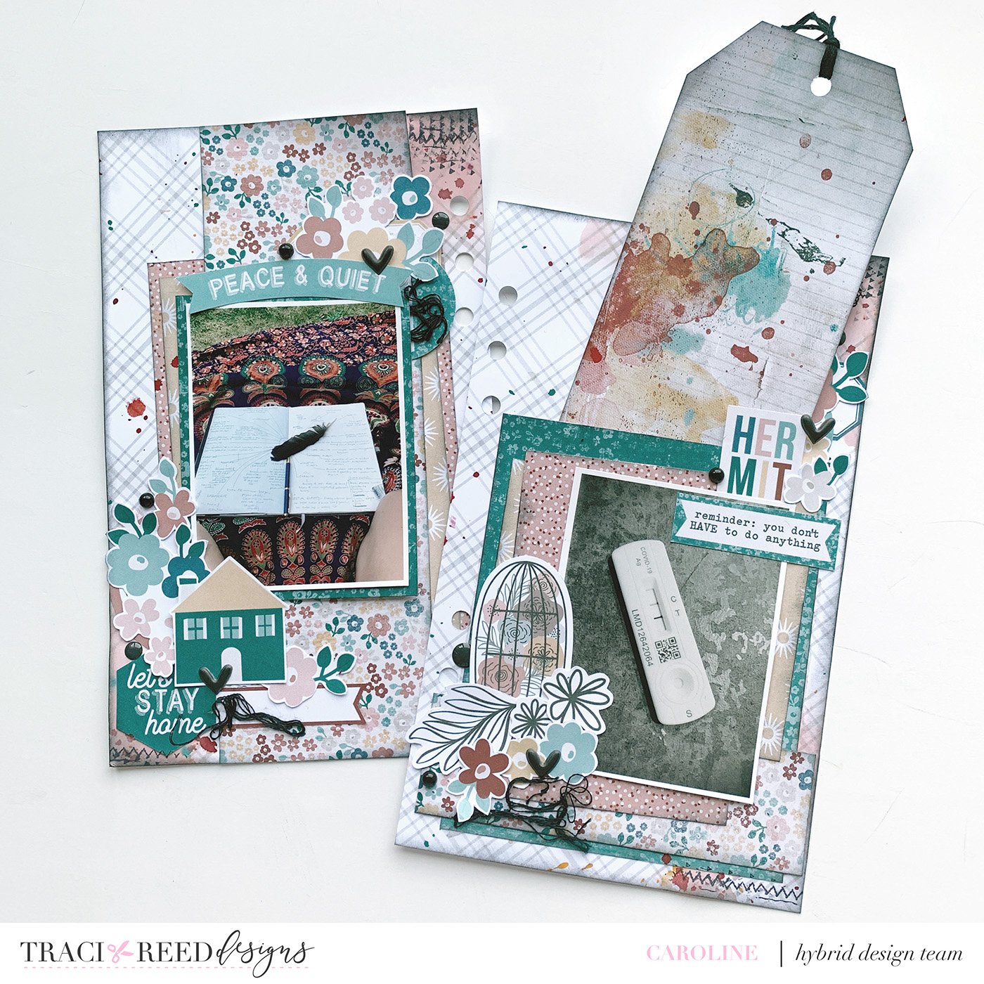
When I first compared the older #Indoorsy collection with the new My Oasis I did wonder how well they would work together... but I trusted in Traci's understanding of the feel of the collections she creates and looked through my files to work out what I wanted to print.
As My Oasis is the current collection I have all of the Traveller's Notebook papers and Die Cuts already printed and cut so I just needed to go through the #Indoorsy files.
I LOVE the grungy/ distressed/mixed media look to alot of #Indoorsy so opted to print a selection of my favourite papers ... and the die cut 'sticker' sheets.
I don't own a die cutting machine so I fussycut my stickers out. I joke about the hand cramp I get after a while but I LOVE to do it and it also means I get a really good look at all of the products as I snip.
There were a few sentiments on the word bits that were perfect for a story I wanted to tell about catching Covid for a second time recently and so I started with those and went from there.
I decided to mix up the papers from both collections. My background paper is from My Oasis (I added ink splatters and messy stamping to it), the paper layers are all #Indoorsy (apart from that layer of golden sunshines - that is a scrap left from a previous My Oasis collection".
The embellishment clusters are mainly from #Indoorsy except from the caged flower doodle (and matching flower doodles) - those are from My Oasis. I usually don't mix floral styles but these worked really, really well!
I added my journalling to the underside of that large tag on the right hand page as I had a lot to say and called it good there.
Once again, Traci was 100% right - these two collections mix beautifully - give it a go and mix them up!
Danica
One of my favorite things to do is mix kits! Traci’s newest release My Oasis, is great because the soft color palate is so easy to work with and to mix and match with other collections. #Indoorsy’s pastel florals work well with My Oasis. It’s super easy to use styles with any word arts that are included in digital kits to create a different look. That’s what I did with one of the word arts from #indoorsy for my title. I just had to scrap this photo of Sherlock and Watson napping together because how purrfect is that sleeping kitty embellishment?


