Mix It Up Monday: Felicity + Wildflower
Hello and welcome to the tenth edition of our fun series: Mix It Up Monday! Today we’re combining two floral-filled collections with similar, but different, color palettes to show how easy it is to bridge between the two collections and make one cohesive layout! Felicity and Wildflower are two springy, happy collections with similar themes and vibes, but where one has pink, the other has yellow and when you combine these two palettes together, magic happens!
Check out the team’s examples below and I can’t wait to see you mix these two collections up too!
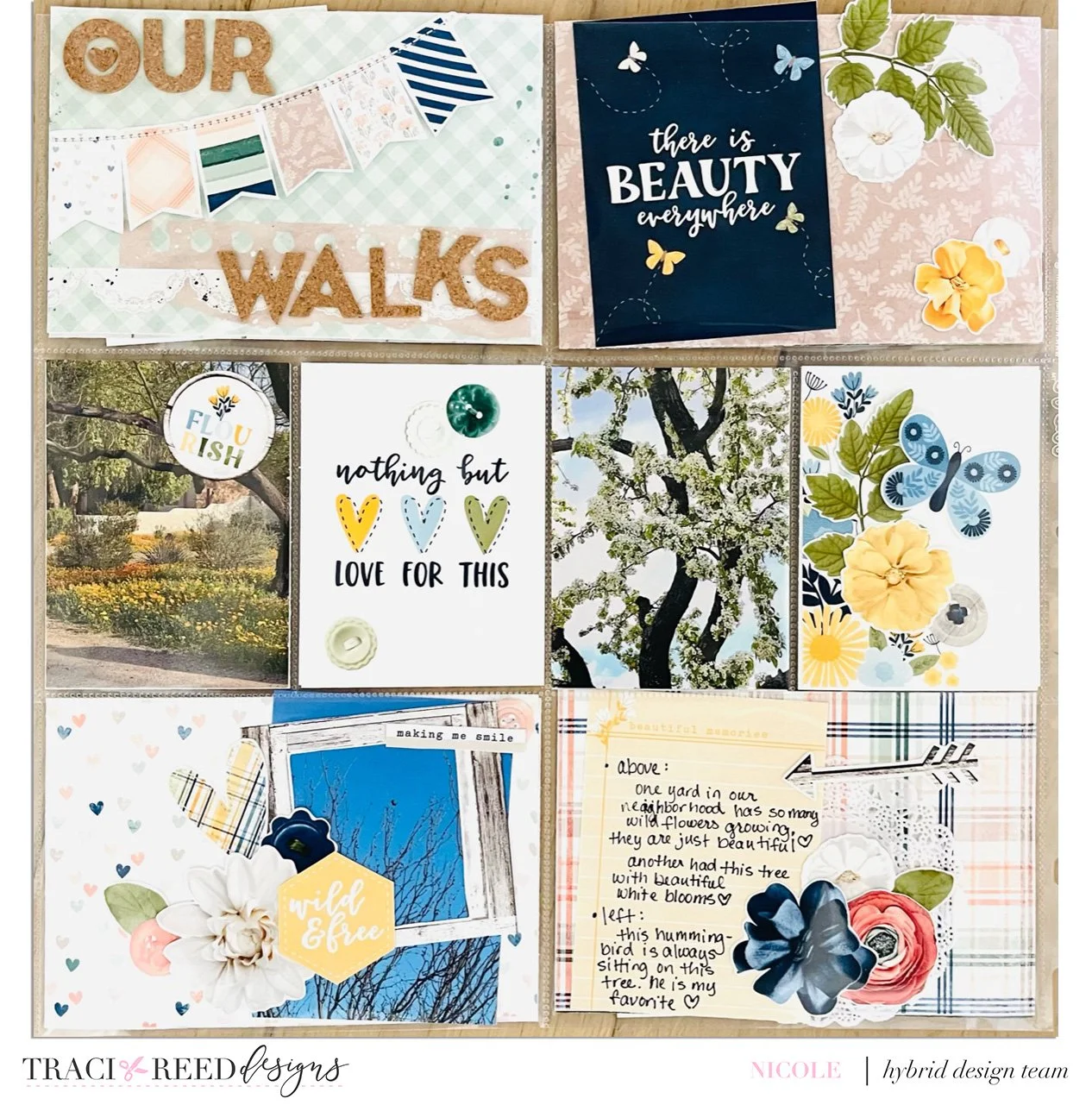
Nicole
I really love the Wildflower and Felicity combo! They are both truly beautiful. I have combined them in a pocket page layout by using some of the 3x4 cards from Wildflower and some of the patterned cards from Felicity and then mixing up florals, buttons, and butterflies. I also added a fun banner from Felicity to my title card. I used some cork alphas from my stash for the title and a doily where my journal card is. I made this page to document some pics from me and my hubby’s walks in February!
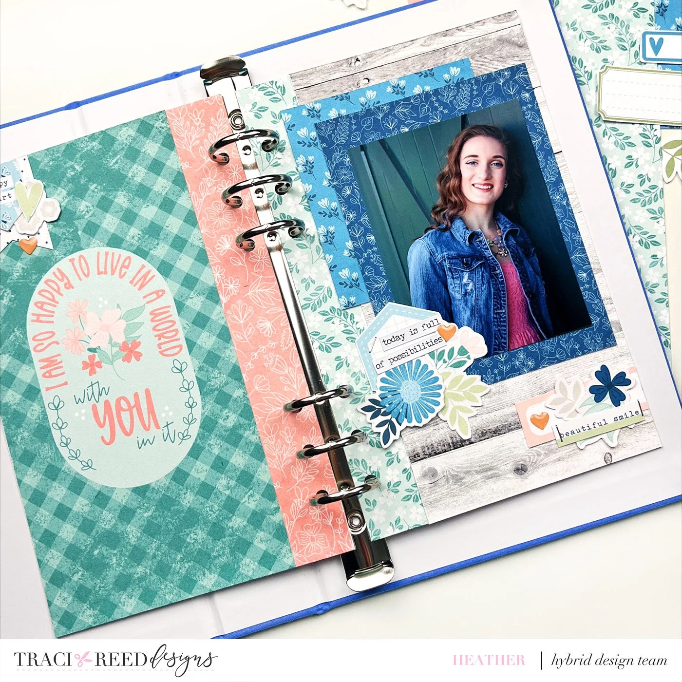
Heather
For this installment of Mix it Up Monday, we are working with the Felicity and Wildflower collections. When I started putting this spread, it definitely took a while to decide what I wanted to use as there were so many possibilities that were appealing to me. I had selected a travelers notebook signature page from the Felicity collection that I knew I wanted to use, and then I chose a woodgrain paper from the Wildflower collection as it was a nice neutral that I could build upon.. Since I was doing a page for a 5 x 8 album, I chose two florals from Felicity to extend the travelers notebook pages to the right size and allow for the holes to be punched without cutting into other elements. I pulled a blue floral paper from each collection to use behind my photo and then I added some elements from both sticker sets to add a few embellishment clusters. Simple to put together for a simply fabulous result.
Becky
This is my first time taking part in Mix it Up Monday and I had such fun mixing the beautiful new Felicity collection with the older Wildflower one. These two collections work so well together. The photos I had chosen were taken at a restaurant called Daisy so I started with printing and cutting daisies from the sticker pack and digital collection from Wildflower. From there I then chose the papers I wanted to use - the green spotted and the pink leaf paper from Felicity and the others from Wildflower. As you can see, they combine really well. Apart from the daisies I was able to use embellishments from both kits concentrating on mainly blue and green with a few splashes of yellow. I finished off with some hidden journalling on the tags behind the photos and some Nuvo drops. My title was created using letters from the digital Wildflower pack which I printed, cut and bumped up on foam pads for some depth. If you haven’t tried mixing collections before give it a go, it’s such fun!
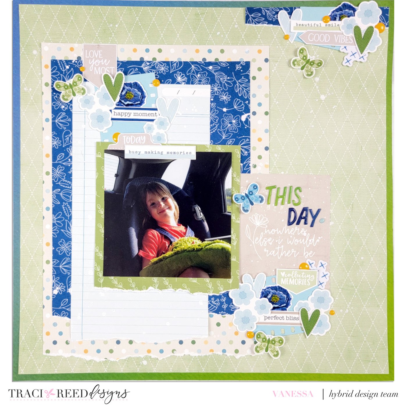
Vanessa
This month we are Mixing it up with the new Felicity collection and one of my favorite collections Wildflower. For my layout I decided to focus on pulling the blue and beige paper and embellishments from Felicity and combining them with the green and blues of Wildflower. I absolutely adore how well these two collections worked together. The beautiful vibrant blue in the Felicity collection coordinates perfectly with the light blue and navy Wildflower.
My best advice with combining collections is to pick one or two colors from a collection and pair it with colors in the same color family or complimentary colors from the other. I think the finished layout seamlessly blends these two collections together and I love how it turned out. I can see myself pairing these two collections together again in the future.
Danica
When I opened both Felicity and WildFlower in PSE, I was delighted to see the denim paper in one and the denim pocket in the second which was the springboard for my layout! I just had to use them both. After that, my layout came about quickly. I just needed things to fill that pocket up! I even managed to stick one of Traci’s signatures in there!! A layout like this is pretty easy to lift and a whole lot of fun to create! Just don’t forget your photo!


