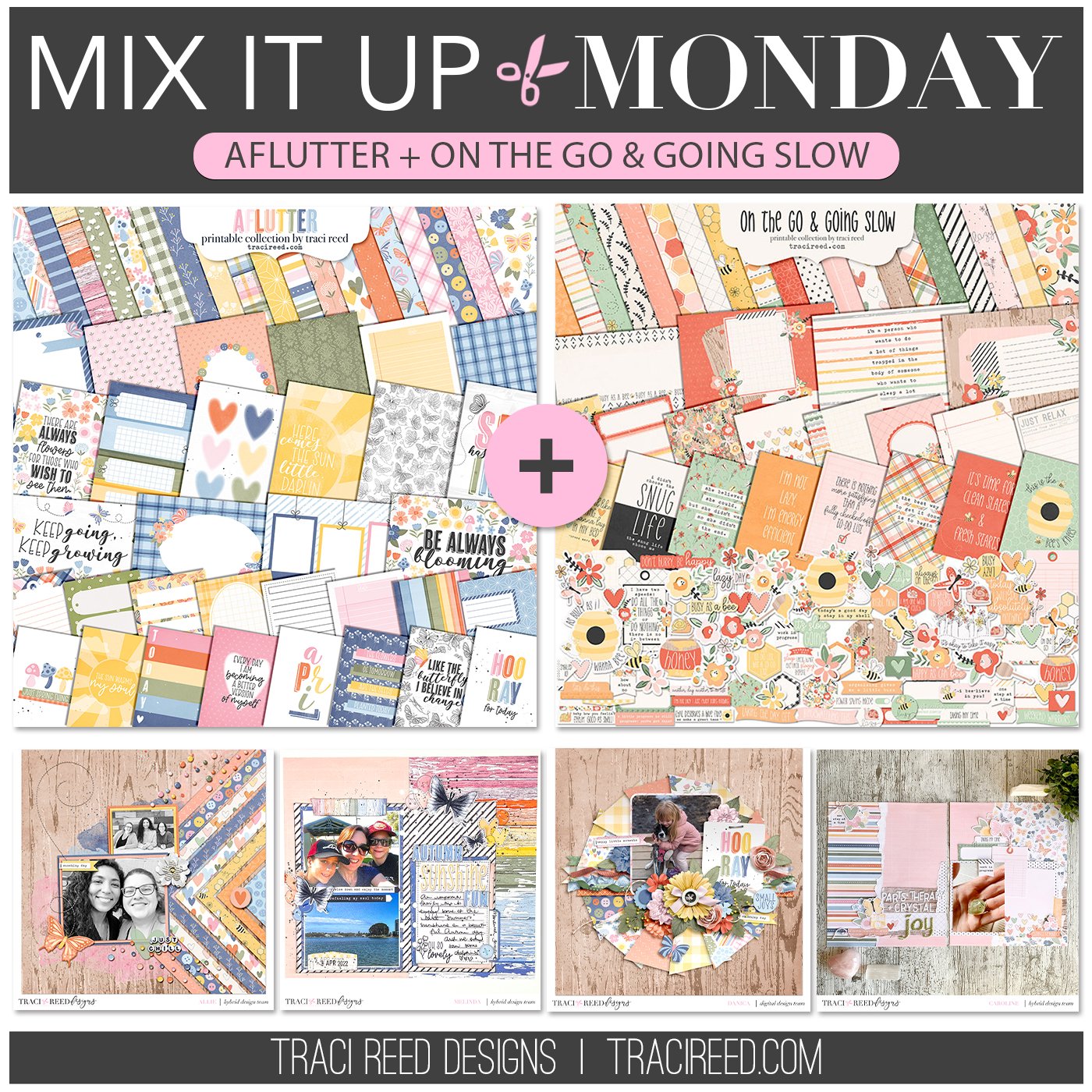
Mix It Up Monday: Aflutter + On The Go & Going Slow
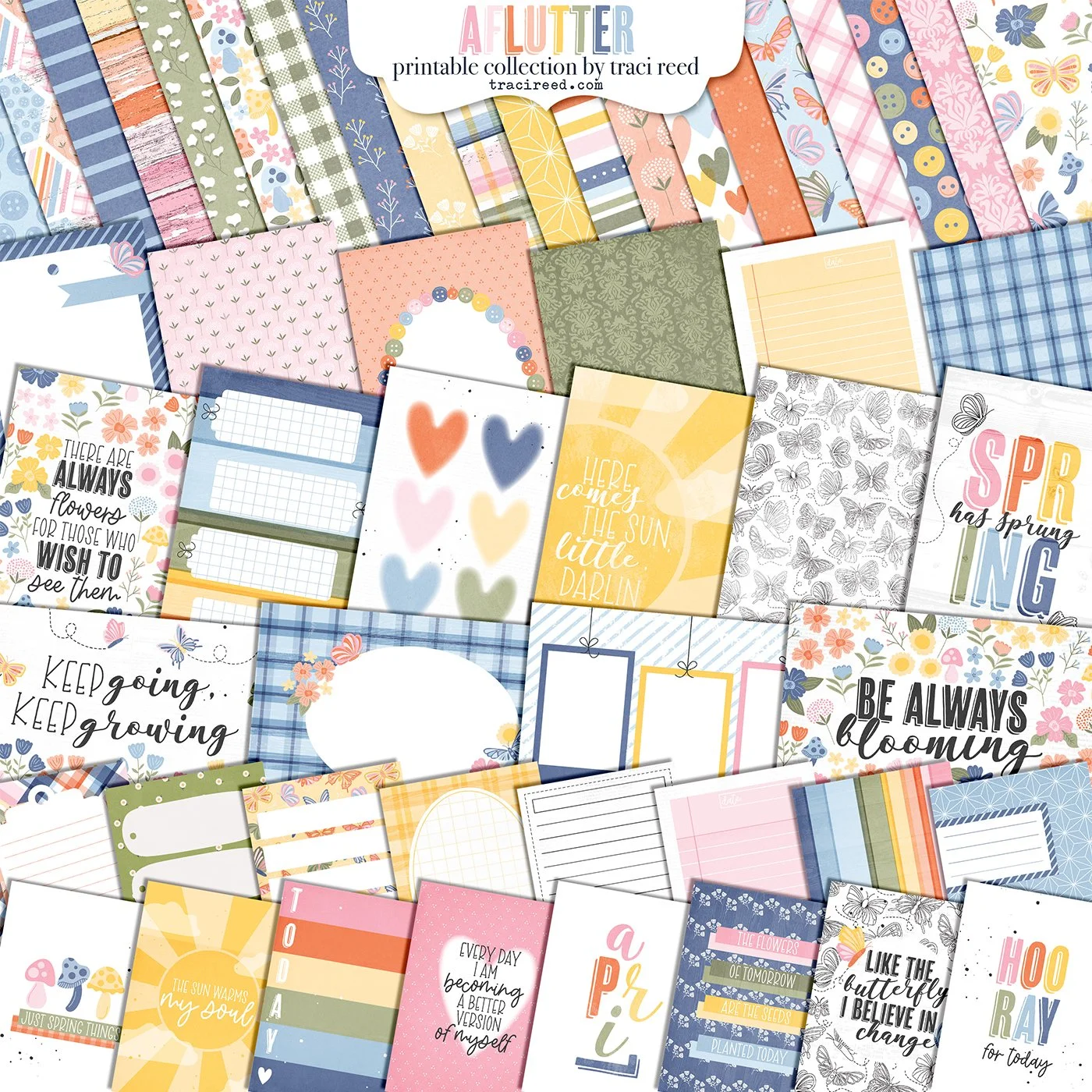
Hello and welcome to the eleventh edition of our fun series: Mix It Up Monday! Today we’re combining two very differently-colored spring collections that both celebrate the love of butterflies to show that the collections you combine don’t always have to match perfectly color-wise to work together!
Check out the team’s examples below and I can’t wait to see you mix these two collections up too!
Allie
I absolutely loved using Aflutter and On the Go together— they match up so well! They both had a little bit of “farm house” vibes, so I started with a wood grain background. I’m obsessed with the papers, so I wanted to use a sketch that really highlighted the papers— so I turned to my favorite sketch! (Check out my blog post here {link} to see other ways I used this sketch with Traci Reed Designs kits!) I alternated collections with the papers to give a more balanced feel between the kits. I loved intermixing the different elements, because they work SO well together!

Melinda
Initially I struggled with combining the 2 collections but after finding photos it all came together. There’s no blue in the Going Slow collection so it was a no brainer adding in the wood grain rainbow and boom!! Page inspiration! I made sure I used the same colours/patterns on each page and had fun combining the 2 alphas for my title. As the Going Slow collection is a warmer white I inked all of my edges with black soot distress oxide to bridge the gap.

Danica
A great way to stretch your stash and make an older kit look like new, is by mixing kits. Traci’s newest collection Aflutter works really well with an older collection On the Go & Going Slow. They both have similar color palettes which makes it super easy to mix them. I love the patterned papers in both so I picked a template that I was able to use quite a few sheets of each collection with. After that I was able to use the florals and greenery in each to create my clusters. Everything was very straightforward and my layout came together easily.

Caroline
I LOVED combining these two collections. Sometimes I struggle to mix two when one is white based and one more cream based in tone. This is my Process for mixing these two collections:
1. Look for one or two papers from one collection to use as the main papers (The stripe on the left hand page and floral/ butterfly on right hand side are both from Aflutter) These showcase the full colour palette of the collection.
2. Look for 2 or 3 papers from the second collection (single, neutral or tone on tone) that match the papers you have already pulled (in my case the pink ledger, black and white papers, brown woodgrain are from On the Go…)
3. Look for a journalling card(s) from either collection that fit the papers pulled (I opted for a 3x4 card from On the Go)
4. Work with paper tears to help combine the papers together with extra texture and interest.
5. Look through the diecut/sticker packs from BOTH collections. Pull out 3 or 4 journal spots to use as a foundation for embellishment clusters. At this point I am now aiming to pull in elements from both collections in each area I am working on.
6. Work with the word phrase stickers, sentiment pieces and icon/motifs to build up embellishment clusters. In my case my clusters have a mix from both collections. I opted to go with sentiments that supported my story and icons such as hearts and butterflies that were already represented elsewhere on the papers/cards.