Mix It Up Monday: Strong AF + Aflutter
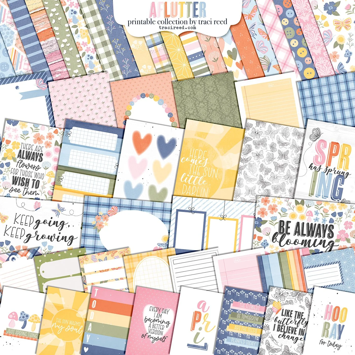
Hello and welcome to the Twenty-First edition of our fun series: Mix It Up Monday! Today we’re combining Strong AF and Aflutter, two collections with WILDLY different themes that actually came together like magic with their similarly toned papers and uplifting vibes!
Check out the team’s examples below and I can’t wait to see you mix these two collections up too!
Danica
I just love how my layout turned out with Traci’s Strong AF and Aflutter collections. I’m not gonna lie, I had my doubts about how these two were going to end up together. But it looks like they are a marriage that will stand the test of time! I started out with “Hooray!!”signature from Strong AF and built my page around it. My photo had quite a bit of negative space on it which was a perfect place to mix some stickers and embellies from both kits. I even added the alpha from Strong AF to a label from Aflutter . Such good stuff in both collections!
Nicole
Hey all! Today I’m using Strong AF and Aflutter to make this layout of my and my hubby. I started with a sketch to get my creative flow going then used papers from the Strong AF collection to do my paper piecing. I used stickers from both collections to embellish my project and finished with cork, sequins, and splatters. You can see my process over on YouTube.
Ronelia
The “challenge” of combining Strong AF with Aflutter really wasn’t much of a challenge at all. Both collections use lots of soft blues and pinks, which was perfect for me documenting my lilac emotional support water bottle. Truth be told, this card from the Strong AF collection made me giggle so I had to use it to tell this story. Mixing the papers and embellishments from Aflutter with papers and cards from Strong AF resulted in this light and airy layout. I really like how it turned out.
Vanessa
For my Mix It Up layout using the Strong AF and Aflutter collections I let my photo decide the color scheme. I pulled the blue, purple, and pink from the collections to complement the photos. I loved the purple grid paper in the Strong AF collection, so I immediately printed that for my background. The rest of the layout came together easily pulling florals and other elements from both collections all keeping to the purple, blue and pink color scheme. I love the result. You can check out the process video on my YouTube.
Melinda
Allie
We all know I love the little pocket page life! For this one, I used Canva to resize and combine Aflutter (I focused on the “change” themes in the cards and stickers especially!) and Strong AF to make a little “title page” of sorts for my new Health/Workout planner. I’ll print this page out and slide it into a page protector … or the front of my binder!


