Mix It Up Monday: My Oasis + Hearth & Hollow
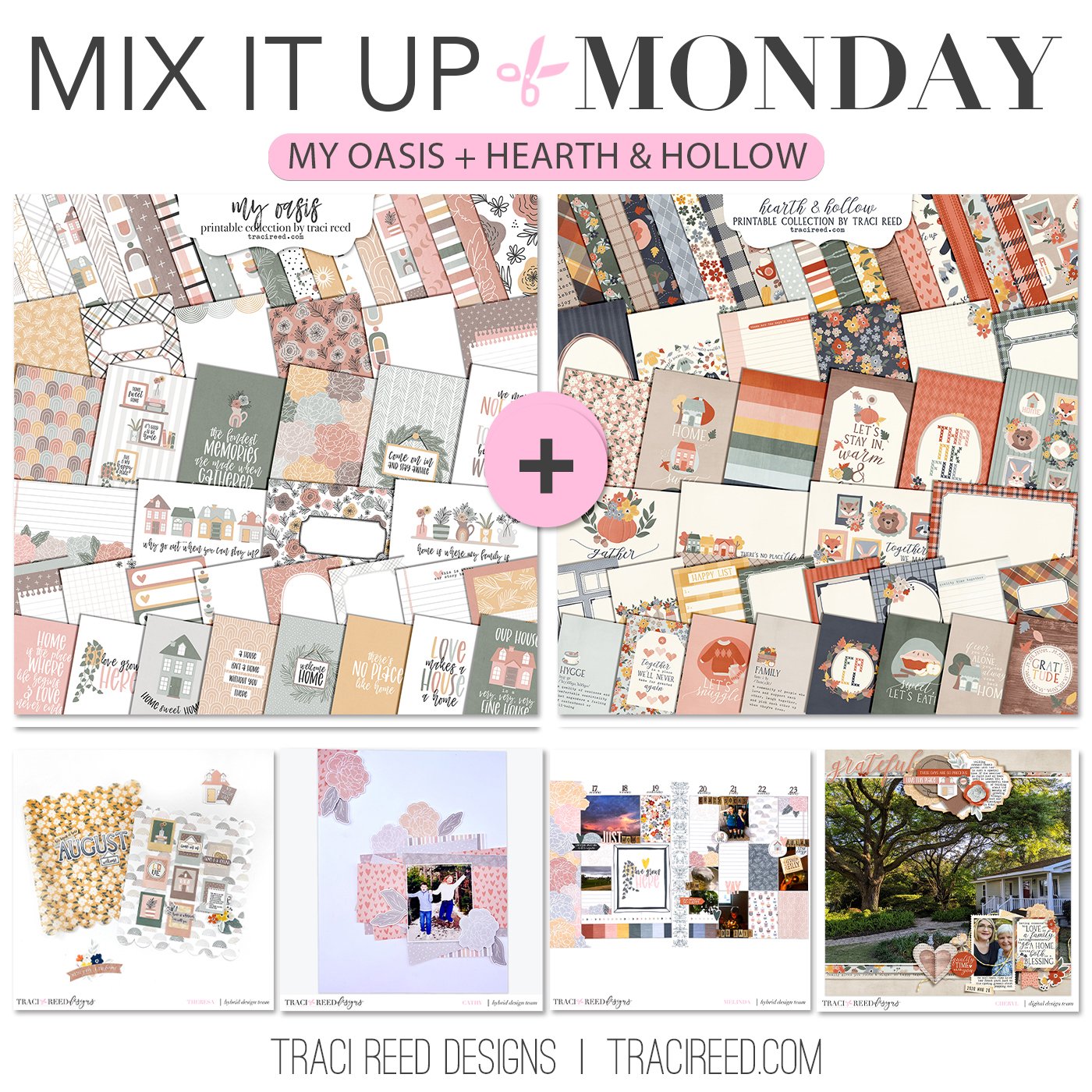
Hello and welcome to the fifteenth edition of our fun series: Mix It Up Monday! Today we’re combining two collections that might now “coordinate” at first glance, but actually go really well together! Both have themes of home with fairly neutral tones and an emphasis on houses and pretty florals!
I loved reading about how they approached the challenge!
Check out the team’s examples below and I can’t wait to see you mix these two collections up too!
Theresa
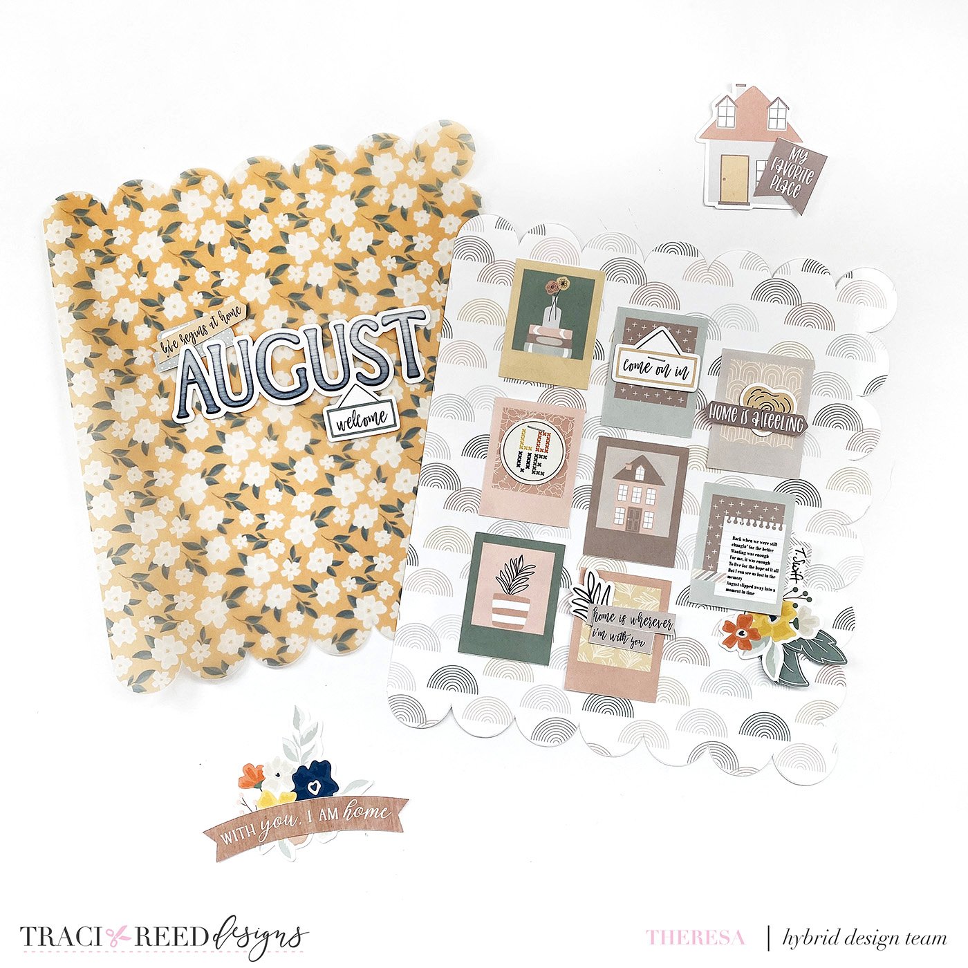
I was so excited to work with these two collections because fall is absolutely my favorite season and these two collections are a fabulous fall vibe! I was inspired by this gorgeous yellow floral from Hearth & Hollow and decided to cut it into a scallop shape on vellum. The frames from My Oasis created the perfect simple grid and a handy spot for some Taylor Swift lyrics, August of course. I also used the alphabet from Hearth & Hollow to create the word August. They pop beautifully against that vellum. With that, I am ready for fall and all its cozy memories. Happy Fall Ya’ll!
Close Up
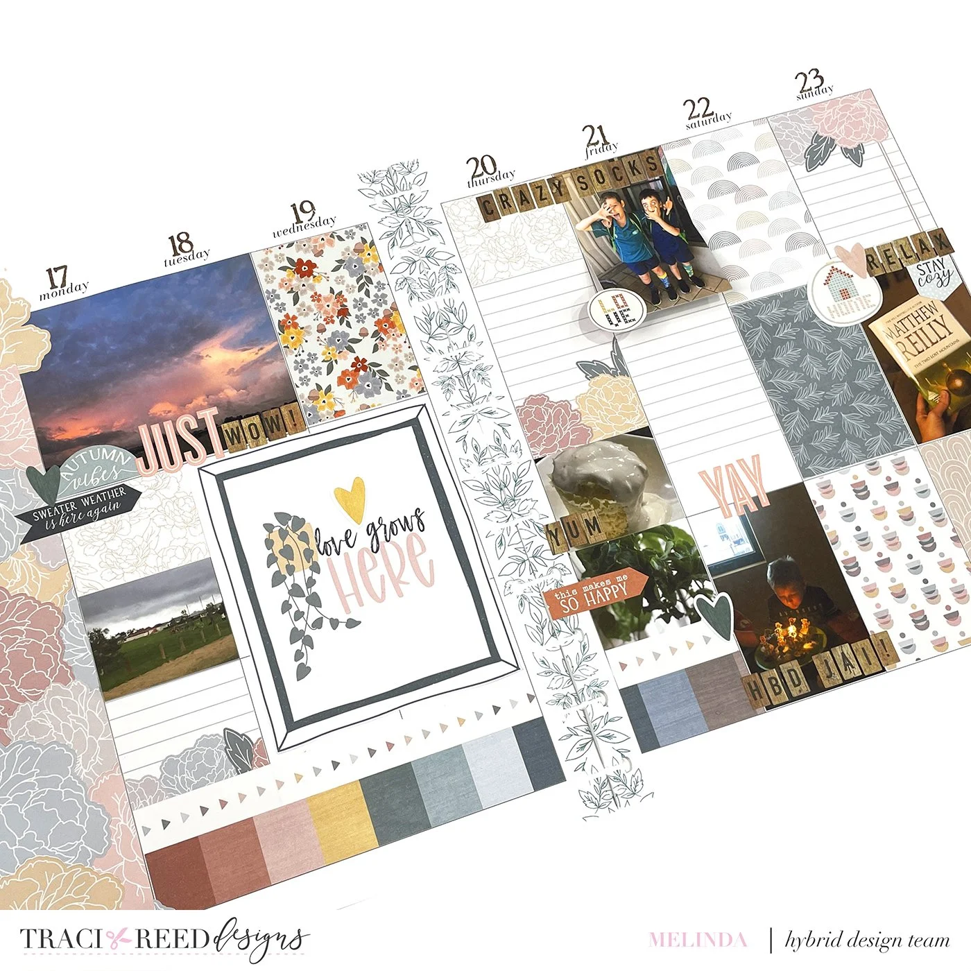
Melinda
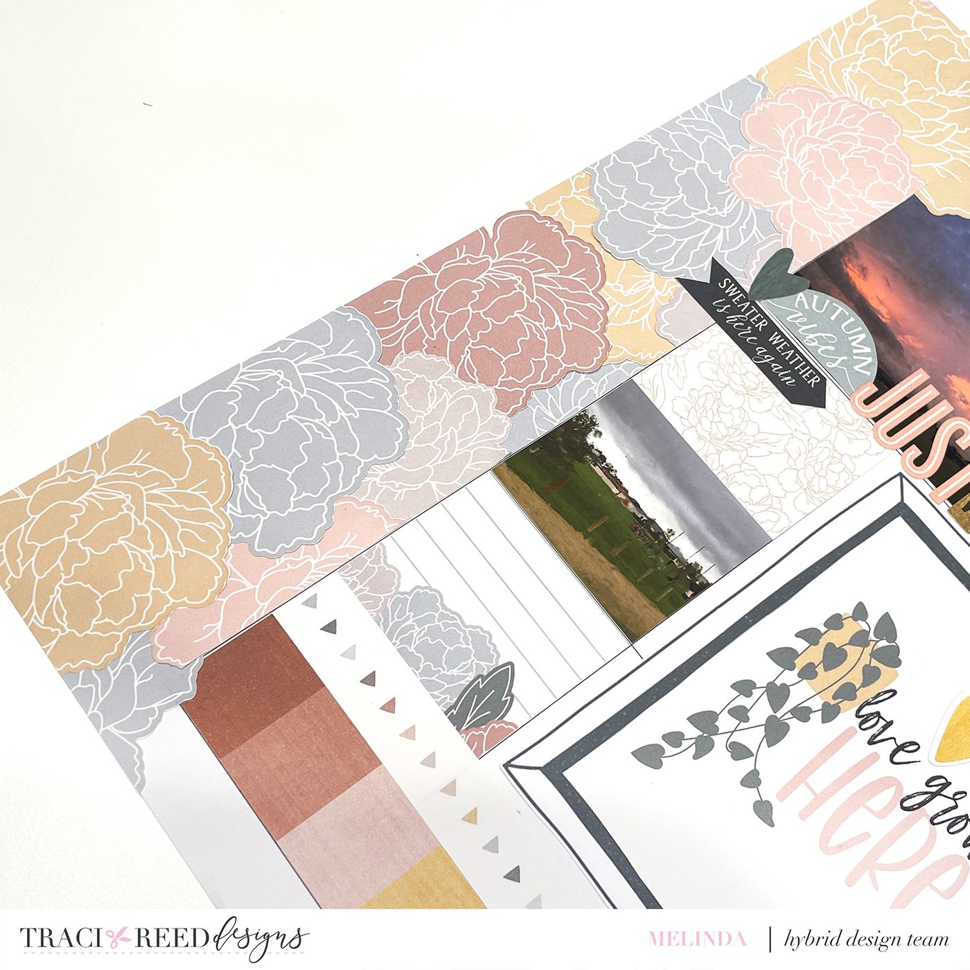
Close Ups
Cathy
Mixing up collections can always feel daunting by My Oasis and Hearth & Hollow was a perfect combination. In order to find inspiration, I found myself flipping through the patterned papers which ended up forming a cluster of papers that I liked as a base behind my photo. The floral embellishments from the My Oasis collection was the perfect way to round out this project!
Cheryl
My mother has the most amazing garden. This is my childhood home, so I have many memories not just of the house, but of the surrounding spaces where I played. These photos were taken in late March of 2020, just as the pandemic was beginning to make itself known in our area. The spring greens of the oak trees and the ferns and shrubs were in full display, and the weather was cool and refreshing, and Mama and I strolled around enjoying the beauty. To build this layout, I began with an extra-large photo that extends across my 12 X 12 layout horizontally. I then chose a card from Hearth & Hollow that summarized our time together: “Having someone to love is a family, having somewhere to go is a home, having both is a blessing.” From that point, I added bits and pieces from both Hearth & Hollow and My Oasis, choosing red embellishments to make pops of color around the mostly green main photo.

