Mix It Up Monday: Moonlit + Sunkissed
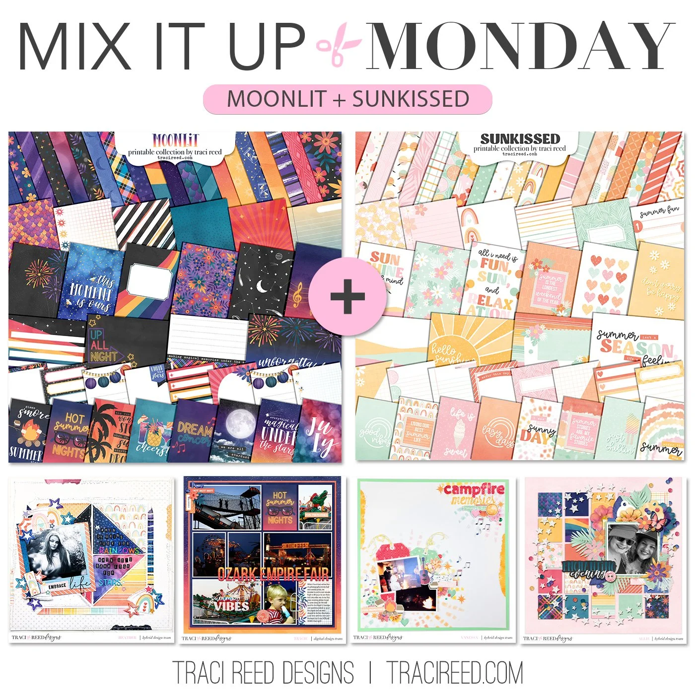
Hello and welcome to the fourteenth edition of our fun series: Mix It Up Monday! Today we’re combining two sister collections that are the day and night versions of summer fun, the brand new Moonlit collection, and last year’s Sunkissed! I was a little concerned for the team at first because they are so very different and even offered them a different collection to combine with Moonlit instead that would match better but they all took up the challenge and knocked it out of the park!
I loved reading about how they approached the challenge!
Check out the team’s examples below and I can’t wait to see you mix these two collections up too!
Heather
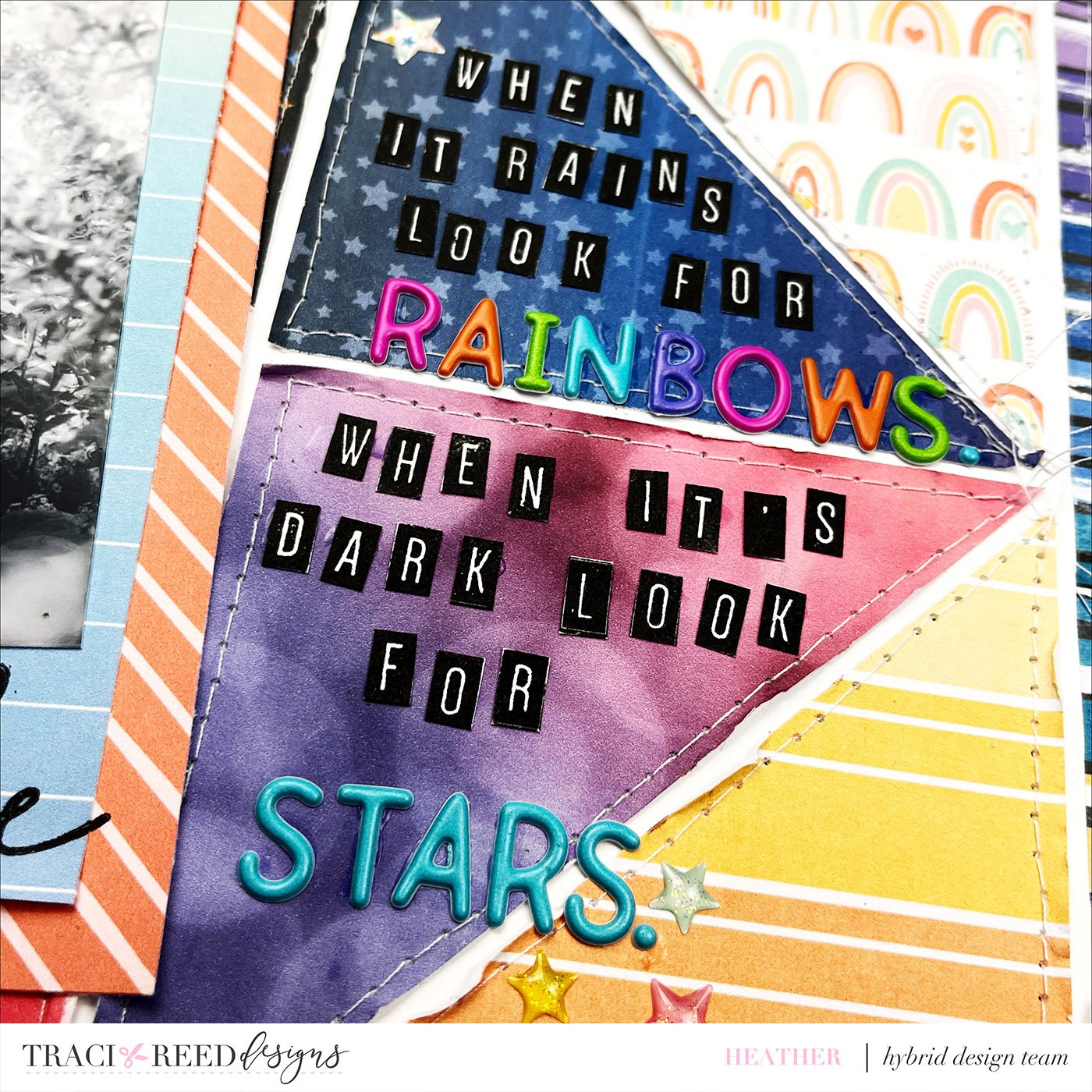
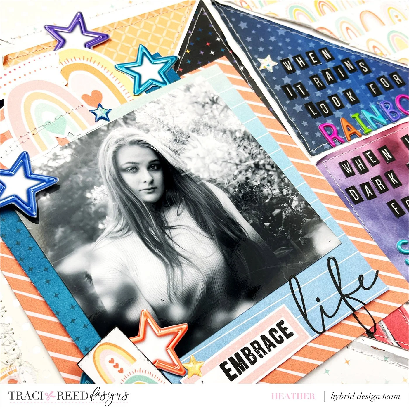
As Traci shared sneaks of Moonlit to the creative team, I started to get a little concerned about how I would pair the bright, bold colors of Moonlit with the more muted pastels of Sunkissed.
Enter two of my favorite inspiration methods, quotes and sketches. I was perusing Pinterest for both and came across the quote that I used on the page, and while I found many possible sketches, I ended up finding a layout that was perfectly scrap liftable for this project. I don’t think the scrapbooker was mentioned in the pin, but I’m pretty sure the layout was created by the one and only Missy Whidden. I ran with the inspiration that I found, and created a layout that I’m incredibly happy with.
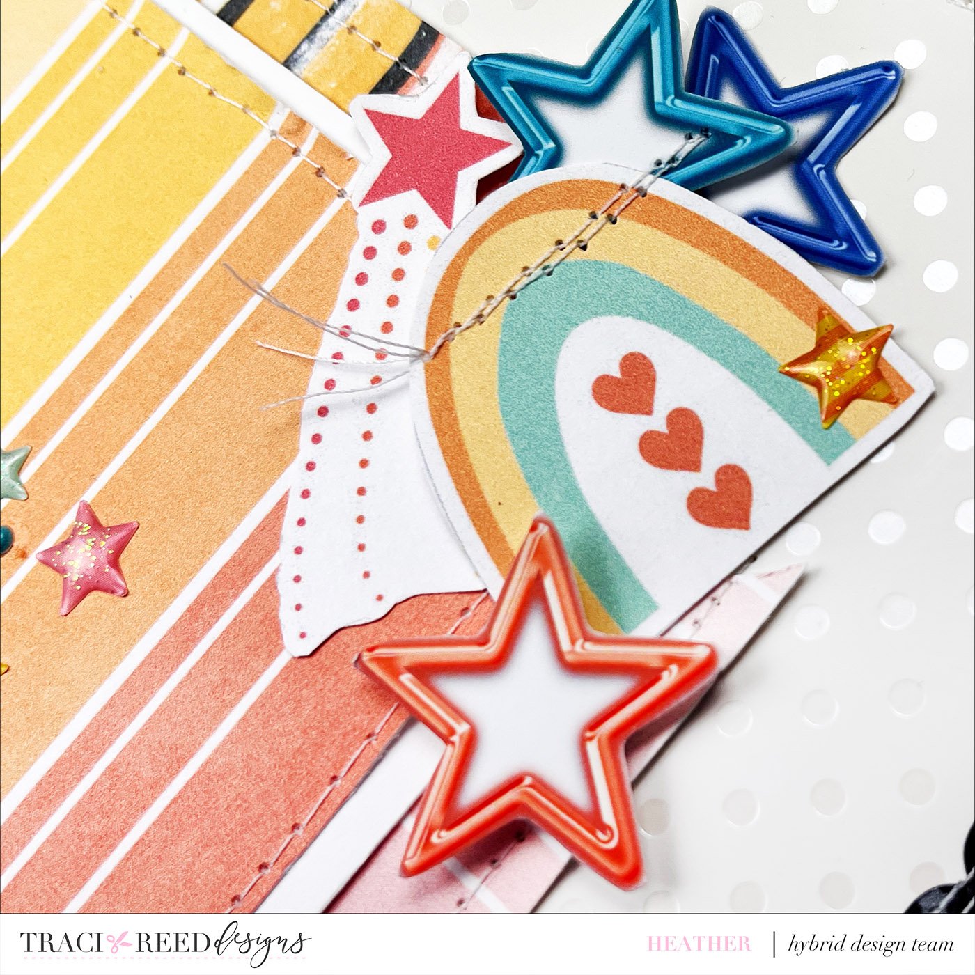
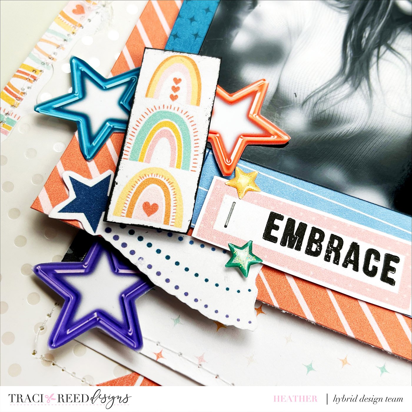
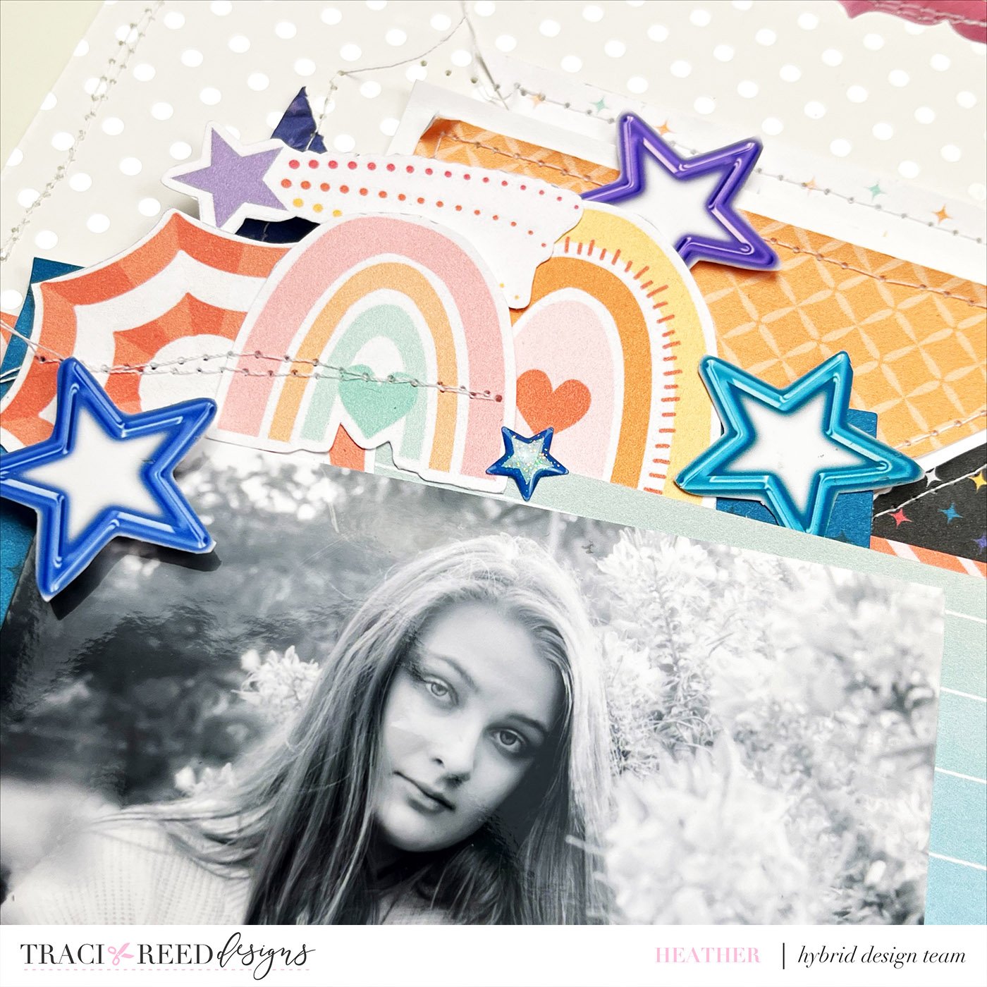
Close Ups
Tracie
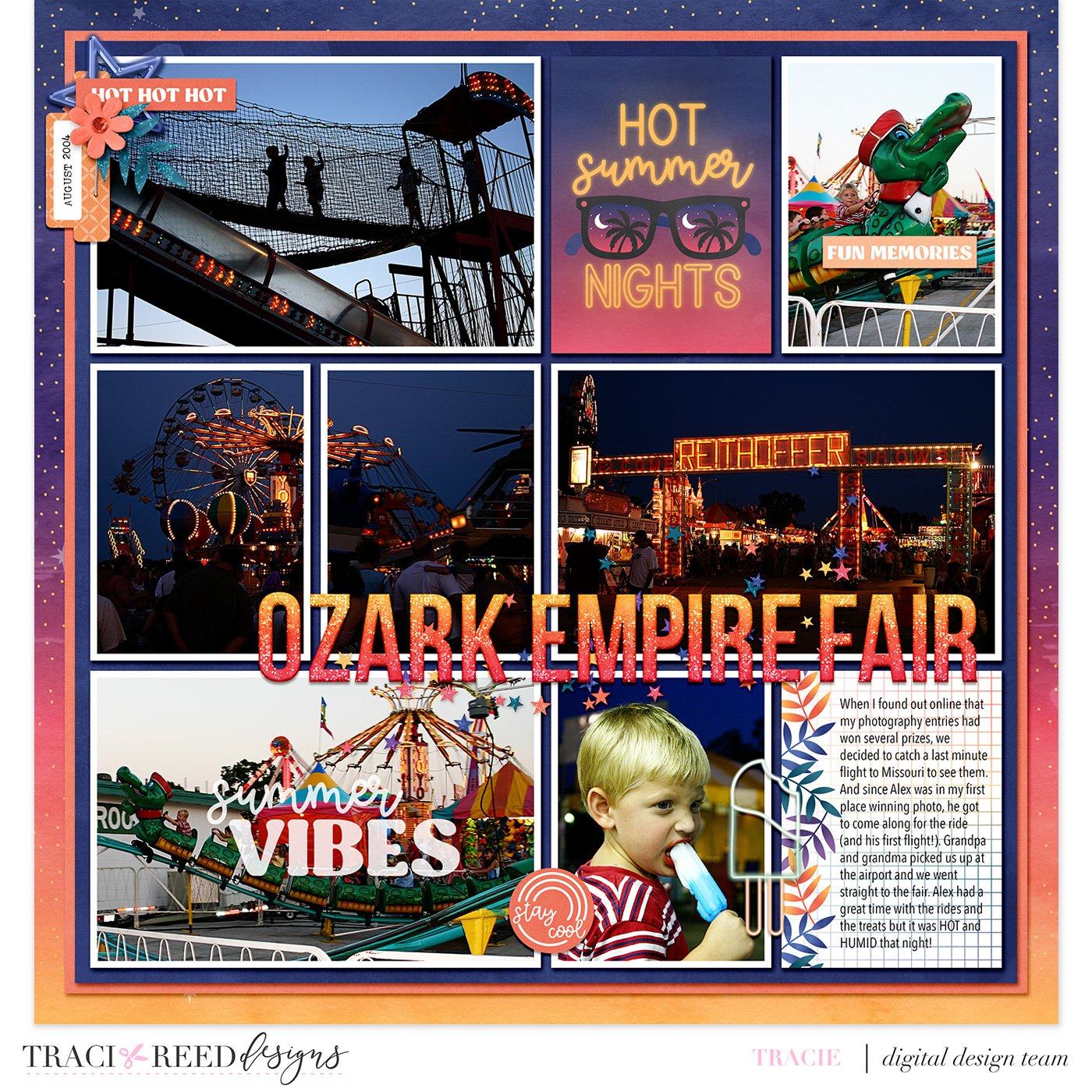
For my layout, I used Moonlit as my base and then accented with stickers and embellishments from Sunkissed. The neon popsicle was perfect to add by the photo of my son with his treat. I also love using stamps on my photos and found the perfect one in the Sunkissed collection. I used the orange paper from Sunkissed as a layer in my stack of background papers to tie the two collections together. I love how it turned out and I love that I finally got these memories from 2004 scrapped!
Vanessa
For my Mix It Up layout using the Moonlit and Sunkissed collections I focused on selecting tone-on-tone patterns from each collection. To create my background, I used the mixed media tie dye element from the Sunkissed digital collection and selected ephemera from both collections to create eclectic clusters of embellishments. The combined layout feels cohesive, and I love the result.
Allie
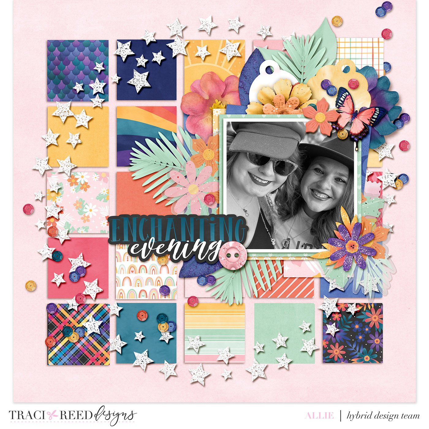
For combining the Sunkissed and Moonlit collections, I knew that I really wanted to highlight the gorgeous papers, so I wanted a background that allowed me to use as many of the papers from both collections as possible. While the colors are pretty different in each collection, there are some common colors, so I made sure to incorporate solids those as some of the squares-- making a pattern between solid papers and patterned ones, just to give your eyes a little bit of a rest before I put even more embellishments on top. While there’s no journaling on the page, the photo I used is from the Taylor Swift concert where the celebrations went from during the day to late late at night… so Sunkissed to Moonlit was the perfect transition! I added in the “Enchanted Evening” word bits to because I was … enchanted to “meet” Taylor!
TRD Products Used in This Post

