Mix It Up Monday: Haunting + Hocus Pocus
Hello and welcome to the sixteenth edition of our fun series: Mix It Up Monday! Today the we’re combining Haunting and Hocus Pocus collections!
Check out the team’s examples below and I can’t wait to see you mix these two collections up too!
Vanessa
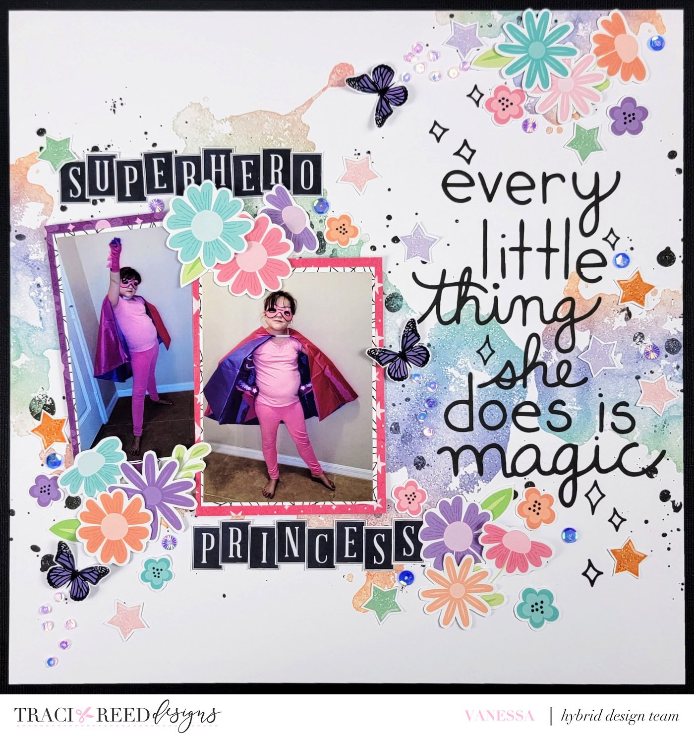
I love how well the new Haunting collection pairs with Hocus Pocus. For this layout I focused on the florals and the pinks and purples in the two collections. For the background I used the digital and stamp elements from the Hocus Pocus collection to customize my background. I paired that with papers and florals from the Haunting. Throw in a few stars, butterflies, and title from Hocus Pocus and you get a fun layout that seamlessly combines these two Halloween collections.
Theresa
Stars Stars Stars! I can never have too many stars on a page. So of course that is the shape and element I chose to use from both the Hocus Pocus and Haunting collections! There were several gorgeous patterned papers in both collections that I’ve used for my background, along with some of the mixed media elements. I tried to play up the spooky a bit with the darker patterned paper, blending it darker at the corners. The black stars that are part of the mixed media elements are the first stars to appear on the page. On my Silhouette I cut out all of the stars from the sticker packs of both collections, along with the October 31 cut file to use as my title. I’ve backed it with one of the solids. My story for this page is our Halloween night from 2017, particularly our son Addison who was a Narwhal Businessman. These photos balance out the cut file on the page along with the journaling spot and the giant moon. The final touch – all of these fabulous stars laid out in an arch at the top of the page, joining together all of the elements and bringing your eye into every amazing detail.
Ophelia
I had a photo in mind before starting my layout. I wanted the photo to be the focal point of the page with layered papers and arranging the elements around the photo. I switched back and forth between Haunting and Hocus Pocus collection to pick and choose what I wanted. Lately, I have not been into using templates so I started my page from scratch. I tend to prefer patterned paper so I begin with that followed by paint. I then go on to adding & cutting paper and then placing elements around the photo. When the page got to a point where I was stuck, I went to Pinterest to see some sketches for inspiration. I ended up removing a couple of elements, adding another paper and journal card and centering my layout. I rarely use alpha and instead chose a word art for my title. Last, I added some journaling to finish out my page.
Allie
I wanted to use all of the gorgeous pinks in both kits to make a layout with a new favorite selfie of mine! I wanted to use bits from the kits, but not have it be TOO spooky, because it's just a picture of me, in the middle of October! Thankfully, those pinks coordinate so well, and there's so many fun accent colors to layer on! I loved using the different floral stickers and 3D flower bits to really make this a "girlie" page, without it being spooky at all! I just love how versatile these kits are!


