Back To Basics: Challenge Yourself to Create a Clean and Simple Design with Raechelle!
Hello scrappy friends! Raechelle here sharing something different for me.
I am drawn to clean, simple, linear designs, however as a creator, it is a stretch for me to create with that aesthetic in mind. So, I stepped out of my typical design style and attempted something new this month.
For this layout I printed a series of square black and white photos which I placed to one side of my layout in columns. Check mark linear.
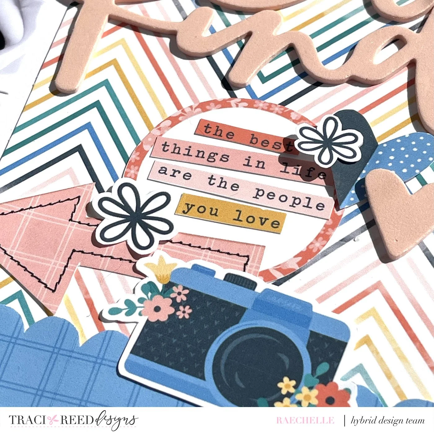
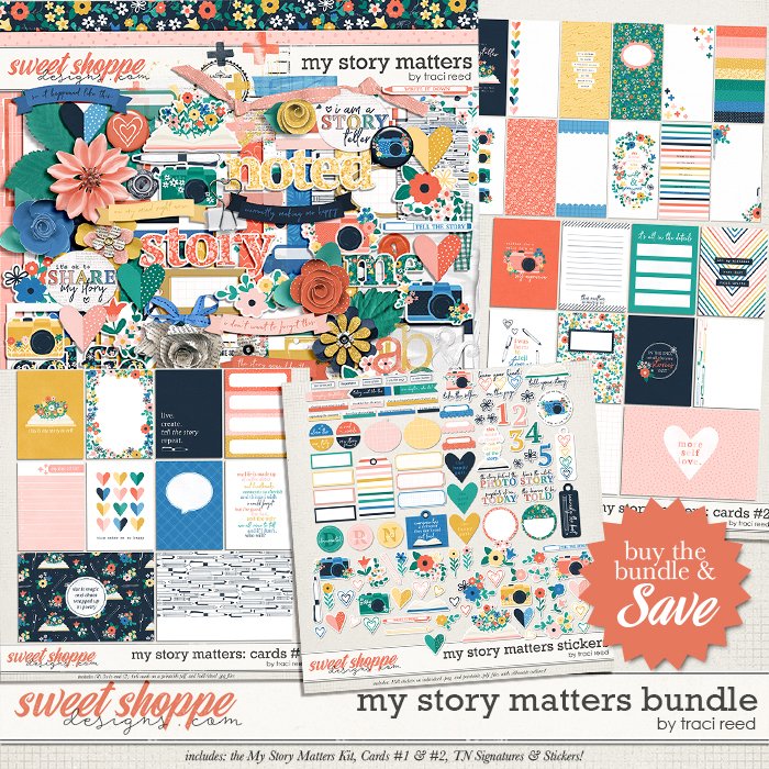
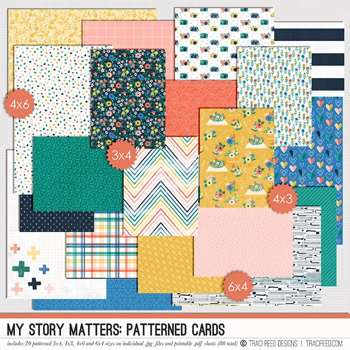
Next I added a TN page from the ‘My Story Matters’ collection. I then fussy cut the scalloped ends from another TN page and placed them atop the patterned paper.
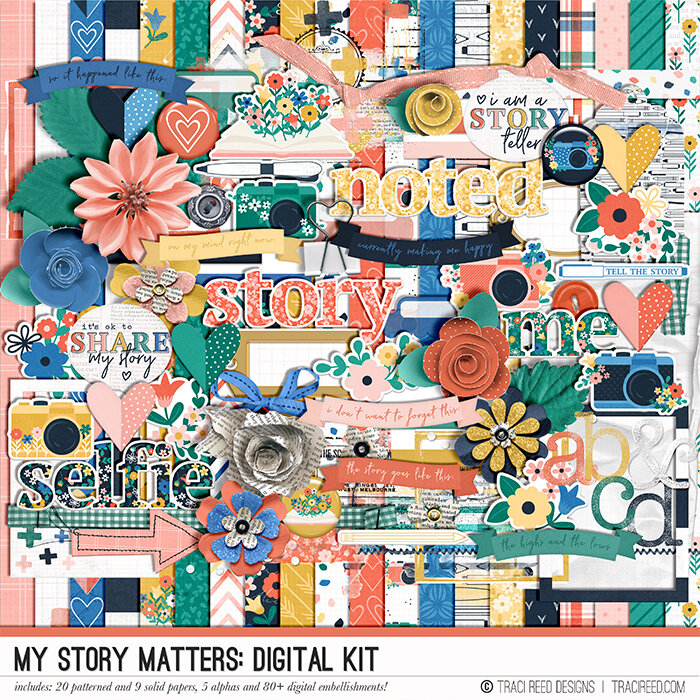
For the cluster I printed some stickers and ellies from the collection and cut the words from one of the TN papers that I placed inside a circle sticker. Keeping true to my style I added a few hearts and flowers and tilted things at a slight angle for a touch of whimsy. The title from an old package of foam Thickers, and I added two additional foam hearts.
For the finishing touches, and to add some color and balance to the photo side of the layout, I added some small clusters using stickers.
I cannot lie- it was a challenge not to add all the florals to this project. Ha! But, I am thrilled with the more simplistic look that I created and will attempt to do so again in the near future.
I hope that you've been inspired to step out of your normal scrappy design.


